Since childhood, I have been a closet fan of television idents (the bits of video that appear whilst a program is being announced). Back in the early nineties, when a channel got a new set of idents, it was a big deal, with all the press reporting on them and casting their opinions. Of course back then, there were only four channels.
For me, such launches were a rare highlight, and I can still remember my excitement of waking up one morning in 1997 to discover the entire BBC had been re-branded (not just channel idents, but a new corporate logo with re-branded BBC Radio stations, news programs, etc…). No surprise then that I ended up writing my dissertation on this topic back in 2001.
Today of course, the televisual landscape is very different, and thanks to Murdoch and chums, we now have hundreds, if not thousands of channels, most of which are of a pretty low production value. New channel idents, branding, logos—even name changes—are ten a penny. It is telling however, that when BBC One launches a new set of idents, it still gets a lot of media attention, more so than any other BBC or terrestrial service.
I wasn’t going to write anything about these new idents, except perhaps to say that they are pretty damn awesome! However, Simon Jobling’s post Rebranding BBC One has prompted me to expand a little on the comments I made there.
Full of Hot Air
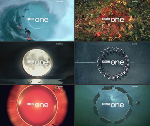
In essense, the forthcoming idents for BBC One, have undone the mess and political correct nonsense Lorraine Heggessey threw all over the channel four years ago with those dancing buffoons. Famously, these idents did away with the popular globe that had been used on the channel for 40 years, and instead tried to conceptualise it—badly.
The last set of idents to feature the globe (which ran between 1997-2002) saw an orange, globe shaped hot air balloon float serenely over different parts of the UK (and all parts of the UK). To this day, these remain my all time favorite channel idents.
When the dancers were unleashed in 2002, we were told that the idea was to take the idea of the globe, and replace it with various dance forms from around the world, using locations within the UK as a backdrop. Instead, later additions to the ident package saw Indian/Bollywood type dancing on a studio set, Masai like warriors in the middle of an African dessert, and a cheap rip off of a Kylie Minogue video. These idents reeked of political correctness and of an idea that had gone a bit pear-shaped.
The New Idents
Thank God then, that on October the 7th, all this is to be replaced. The new concept is that these idents are based around a circle, but let’s not kid ourselves, it can easily be seen to hark back to the channel’s heritage, and to the globe. Given that these idents retain the red signature colour from the previous set, I can’t help but feel this is the identity package we should have got in 2002.
The BBC Logo
In his post, Si also talked about the BBC’s logo:
The corporation are fundamentally stuck with their blocky, Gill Sans BBC logo for a long time to come (think how much it would cost to change that across the board!)
I think Si may have missed the point here. The reason the BBC ditched it’s previous ‘slanted’ logo in 1997 (one that had only lasted 9 years) was many fold. It’s slanted design meant that it was hard to reproduce on screen, and it also relied heavily on the use of colour meaning it was expensive to reproduce. It also dated very quickly.
These were all problems Martin Lambie-Nairn and his team tried to solve in the logo we see today, and I believe successfully so.
The current logo is clean, simple and uncomplicated, yet is also stylish at the same time. The use of Gill Sans gives a sense of authority and history (and echos the link between Eric Gill and the BBC—whom sculpted the statue of Arial outside Broadcasting House). Furthermore, its simplicty enables flexibility, and so can be applied to most designs and work as part of a larger logo (such as in these new idents for BBC One).
I tend to think of the current BBC logo much in the same way as NBC’s peacock, or the CBS eye—both of which are very simple forms, that have standed the test of time.