Journal tag:paulrobertlloyd.com,2008-09-21://1 2011-06-09T09:01:16Z Paul Robert Lloyd is a Graphic Designer working with emerging technology start-ups, and delivering beautiful visual interface design, information architecture, HTML and CSS. Movable Type 5.031 Two Years tag:paulrobertlloyd.com,2011://1.297 2011-06-08T22:46:23Z 2011-06-09T09:01:16Z Two years ago I joined Clearleft. Now with the responsive design movement in full swing, I look back over the last two years to see how much my approach to web design has changed. Paul Robert Lloyd http://paulrobertlloyd.com/ Two years ago today I joined Clearleft. It was only by virtue of a peculiar career path--one that saw me working for a company in a different country--that I was introduced to its three founders, and soon after given the opportunity to join their respected agency.

This early in my career it seems foolish to suggest I've reached its pinnacle, but Clearleft provides me with such a nourishing and supportive environment, that I'm sure I'll one day achieve it.

My confidence has increased to the point that I feel able to take on a more active role in the community--be it something small like releasing an icon set, or writing about potentially controversial topics on this blog. More recently, I have even started accepting public speaking engagements.

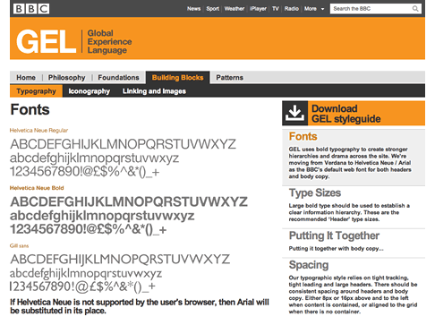
I now get to work with companies my mum has actually heard of, and I find it deeply satisfying to have a portfolio containing work for the BBC, Channel 4 and Mozilla.

Of course, working at Clearleft also means I get to work alongside some of the industry's most renowned voices--and some lesser known but equally talented and inspirational minds too. Yet it has been the analysis, debate and reappraisal of techniques, technologies and processes, usually over lunch but also when reviewing each others work, that I've found the most valuable.

I often take this resource for granted, as I build an assumed knowledge that others may not have been privy too. To this extent, I think being part of a separate community such as the Multipack (and one located outside Brighton) gives me a better perspective on how others are facing the same challenges, and approaching the same problems.

]]> A More Focused Role

Deciding to work at Clearleft did come at some cost though. I pride myself on being able to build what I design--indeed I think this is what attracted me to web design in the first place. Yet my role so far has been that of a 'Visual Designer', meaning I'm less likely to be producing the HTML and CSS that has been spinning around in my head as I've been creating a design.

I accepted this more restrained role knowing that it would give me an opportunity to perfect my design sensibilities, and better understand how this role fits into the entire process; one that for most other designers can be more siloed and less collaborative.

In fact, collaboration is the most enjoyable aspect of my job. Working alongside colleagues who possess differing strengths yet equally wide ranging skills not only ensures the creation of better products, but is way more fun too!

In Which Things Became Much Clearer

With the responsive design movement in full swing (buy the book!) it's funny to look back over the last two years to see how much my approach to web design has changed. The fluid versus fixed layout debate has raged on for years, and whilst I appreciated the arguments for fluid design, I stayed firmly within the fixed width camp. Fixed designs fitted well into the process--both during sign-off and when handing over to a developer--but honestly, the unpredictability and lack of control that fluid design presented meant it wasn't something I was keen to embrace. Fixed design felt like a more pragmatic approach, but at what cost?

Jeremy would say I was making excuses, not designing for a medium where the user has ultimate control over the appearance of a website--whether us designers like it or not.

He would often make the case that we were creating false and unfounded assumptions in order to create constraints to design against. A compromise was reached where Natalie and Jeremy would build fluid sites, but wrapped within fixed containers.

It wasn't long before those shackles were removed.

The proliferation of different devices and screen resolutions, uses and contexts has thrown these misplaced assumptions into sharp relief. If we never really knew how a user would experience our designs before, we certainly don't now.

No Shortcuts

These developments have occurred just at the point at which we are embracing the latest updates to the web platform, with exciting advancements in HTML5 and CSS3. This has a similar feel to the web standards movement that took off just as I was beginning my career seven years ago.

Back then we replaced table layouts with those based on CSS. This involved such a subtle change on the surface, that it meant we could adopt these new technologies without having to change our design process. A common consensus suggests the same is true today.

For example, upgrading your site is as easy as swapping out the doctype and replacing a few semantically named <div>s with corresponding HTML5 equivalents.

Whilst that may be technically true, in venturing only this far you will have missed much of what HTML5 has to offer, be it better integration with the browser via JavaScript APIs, or the ability to add more structure to our documents. Spend just five minutes with a HTML5 Outlining tool (I particularly like this extension for Chrome) and you'll soon realise how much more there is to this specification.

I suspect the prevalence of front-end development frameworks has reinforced this mindset, with the underlying premise being that the hard work has been done for you. Need a grid? 960.gs. Want to achieve a certain behaviour? Download jQuery and one of its many plugins. Want your site to be HTML5? Use HTML5 Boilerplate.

I don't want to come down too hard on frameworks. I think they can be invaluable tools; great for rapid prototyping, but also useful educational resources too.

In fact, I've been spending quite a bit of time with the HTML5 Boilerplate recently. I've found it to be a fantastic introduction to browser inconsistencies, performance improvements, and even how to automate a build process. There's no better way to learn about a technology than from within the code that makes it work, and I've enjoyed reading many of the articles provided in the comments.

Yet HTML5 Boilerplate has little to do with HTML5 and it's far from being a boilerplate. More a collection of best practices for HTML, CSS, JavaScript and server configurations, I find it best suited as a starting point for creating my own boilerplate, which is then adapted to support differing development requirements. I believe this was the original intention of the project, but given the number of websites I've come across where the text selection colour is bright pink (the default value provided by HTML5 Boilerplate) would suggest many have ignored this fact.

Responsibly Responsive

The same is true of responsive design. Again, the assumption is that this technique can somehow be retrofitted into our existing projects and processes. In his original article, Ethan Marcotte explained that responsive design is composed of three elements:

  • Flexible grids
  • Flexible images (and videos)
  • Media queries

Whilst much of the genius of responsive design comes from those first two, many seem to have latched onto the third, ignoring the fact that you can create responsive layouts with little or no media queries at all.

Even if you have grasped the entirety of this technique, you still need to recognise the underlying reasons for using a responsive design approach in the first place. If we are talking about truly device independent design, then the attributes of popular devices can't be the looking glass though which we make our decisions. Furthermore, if we are talking about adaptable design, fixed pixel widths can't be our measurement, nor can layout be the only focus of our attention. I've seen little discussion around how different input methods might effect our design choices, but I'm sure this will come.

If there is a simple truth underlining the responsive design approach it's that you can't assume anything. However, if one thing can be relied upon, it's that relative units, percentages and ems are far more robust than a fixed units like the humble (device) pixel.

A New Process

But wait, there's more! If you've accepted the responsive web design approach and understood the reasons for following it, then you will have soon realised that the traditional linear design process breaks down pretty quickly once you are designing for the unknown.

It was with much anticipation that I waited for Ethan to take to the stage at last months An Event Apart. Here he would unveil not only the work he and Filament Group have been doing with the Boston Globe on their upcoming responsive redesign, but more importantly, talk about the design process behind it. How do we design a responsive website? What's the answer!

Sadly, there turned out to be no magic bullet. The solution he proposed was close collaboration with developers, working in an iterative, back and forth process, slowing refining designs so they would work across a variety of different devices.

This is hardly surprising. After all, this is exactly what we should have been doing anyway--collaborating with developers rather than handing over pristine static comps.

This rich, interactive yet highly unpredictable medium has never been well represented by the static visual (even less so when printed out on paper). Only a conversation between a designer and a developer can ever hope to communicate the various complexities and subtleties to ensure we create end products that work as intended.

If we are to go one stage further, ultimately our clients that need to understand that websites are not something that can be redesigned once every two or three years--they need to adapt as often as their users expectations and needs are changing. To not iterate and improve your offering online, to ignore customer feedback and usage patterns, is to miss a fantastic opportunity the web presents.

Luckily I've been able to work with a few clients at Clearleft who understand this. Through constant iteration, testing and a degree of trust, we are building sites that are gradually evolving and improving, rather than those left to stagnate.

Conclusion

I'm thankful to be working with a design agency that is treating the web on its own terms and looking to embrace the myriad opportunities it presents. Our processes are being rethought in ways that increase collaboration between designers and developers, although such a fundamental shift in workflow is never easy.

At the same time I wish to see similar maturity reflected by my peers. We can only tackle the complexities and challenges inherent to this medium once we've accepted that we can't rely on previous methods of working, or swap in new techniques for old.

It is these challenges, and the excitement that comes from understanding new technologies and approaches that has reaffirmed my love of the web.

Whilst some designers are deciding to jump aboard the iOS bandwagon, I find myself strangely turned off by it all--especially given it's proprietary and closed nature. At the same time, Andy has been careful to remind me that I shouldn't totally dismiss native platforms; there is real innovation happening there that can, and should, be transferred to the web.

Whilst we may have got a lot wrong, one thing our industry has always got right is the community, one that is willing to share ideas and exchange knowledge. We will need to rely on this more than ever as we transition from old habits to new ways of working, and I look forward to being part of that ride.


I'll be speaking more about this topic at this year's Geek in the Park. Join me, Relly Annett-Baker, Andrew Disley and James Willock for a relaxing day in the park and an evening of illuminating talks. It takes place in Leamington Spa on the 13th August. You can find out more information about the event here.

]]>
Ampersand & More tag:paulrobertlloyd.com,2011://1.296 2011-05-13T22:37:48Z 2011-05-14T12:45:00Z Much of the excitement has come in the form of web conferences, and looking back, I find it surprising just how many I've attended this year already. Paul Robert Lloyd http://paulrobertlloyd.com/ Hard to believe that it is May already; another year that's flying by. Luckily it has been fairly fun packed so far, with much of this excitement thanks to the many web conferences I've been to this year. It kicked off with The Design of Understanding and New Adventures in January, with SXSW following in March, and only last month I was attending UX London. It hasn't just been the big events either; tomorrow sees a mobile focused Multipack Presents, which due to its growing popularity has now relocated to a larger venue.

I've also been trying my hand at speaking myself, largely around themes of style guides and web native design. I deliberately started with small appearances in front of friends at Multipack events before speaking to less familiar faces at an APA Digital Breakfast in March. Last month I spoke at Oxford Geek Nights, a fantastically popular event that meant presenting with a microphone for the first time--far harder than you would imagine. Once I got over my initial nerves and found my flow, I was enjoying myself so much that I honestly didn't want to stop! For those curious how I did, there should be video of my talk online shortly.

Still, I'm an attendee at heart, and if there is one thing that governs my choice of conference, it's a single track. I too share Jeremy's frustration with multiple track conferences, especially those that distinguish between design and development which I believe is a largely false division. There's something about a single track conference that makes it feel more curated and focused, with everyone's collective experience allowing for common themes and ideas to emerge.

]]> Ampersand

With that in mind, and excusing the obvious bias, I'm massively looking forward to Ampersand, Clearleft's new conference tightly focused around web typography. This is a topic which, as Rich suggests, many designers would benefit from having a deeper understanding:

There's so many interwoven, and sometimes adversarial, disciplines involved that I felt that everyone's tale needed to be told. I wanted to try and tell the whole story in one day, from experts and practitioners of the different disciplines. I felt that if I, as primarily a website designer, knew more about the type design decisions, the hinting process, the issues browser makers have, then I could become a better designer.

Obviously web typography is a topic close to Clearleft's heart, especially given our day-to-day experience working on Fontdeck and helping foundries bring their fonts to the web. Yet as Rich explains, there is something for everyone designing on the web--the web is all about typography after all. I think this event promises to be really special, even more so given the giveaways, Phil Baines type tour and $20 worth of free webfonts for each attendee.

Perhaps more noteworthy however, is that this emerging industry has maintained the community feel of the web standards movement it was born out of; it's fantastic to see both Typekit and MyFonts sponsoring the parties, with WebType and Hoefler & Frere Jones around on the day too.

There are still tickets available, so if you haven't done so already, you'd better grab a ticket soon. The conference takes place in the Brighton Dome Corn Exchange on the 17th June, and tickets cost just £125 (or just half price for students).

More to come

If this wasn't enough, Geek in the Park returns in August shortly before dConstruct will attempt to improve on last years widely applauded edition. This year it will form part of the new Brighton Digital Festival.

The event I'm really looking forward to however is An Event Apart DC in October. I've experienced this conference series twice before and loved each and every minute; with Jeremy waxing lyrical about this year's line up of speakers, I could no longer resist a third visit.

Hopefully this east coast activity, and my brief return to San Francisco for Dan and Lizes wedding a week later, will give me enough time to traverse the continent by train again. I've been looking at travelling on the Canadian, departing from Toronto and stepping off the train four days later in Vancouver. That's four whole days. On a train. I need to think this one through!

So, there we have it. Lots to look forward to, and still much to plan, yet I suspect all too soon this will be yesterday's news. Should you wish to follow which conferences I'm attending or speaking at, be sure to visit my profile on the increasingly amazing Lanyrd.

]]>
Why I'm Voting Yes to AV tag:paulrobertlloyd.com,2011://1.295 2011-05-05T00:30:51Z 2011-05-07T14:52:48Z Whilst I no longer want to 'tactically vote' or have my MP hold on to a 'safe seat', I'd much rather see continued reform towards fairer representation across all parts of government. Paul Robert Lloyd http://paulrobertlloyd.com/ Last Friday I enjoyed the royal wedding of Prince William and Catherine Middleton, whose new titles--the Duke and Duchess of Cambridge--lead to much research on what peerages are, how they actually work and a continuation of my present fascination with the history of the House of Windsor.

Whilst I certainly understand the arguments made by a vocal minority campaigning for the UK to become a republic, given the relative stability we've found with our current constitutional settlement, and with the traditions and continuity the Royal Family provides, I'm perfectly happy for us to retain the monarchy.

Having a sovereign that is unelected and hereditary only works on the basis that her government, with the power to enact laws and collect taxes, is democratic and representative of the people. Whilst the Royal Family has modernised and adapted itself to stay relevant (a process that is likely continue on the accession of future monarchs), it seems ministers are less inclined to reform their own institutions in the same way.

'The People Say Yes', a video produced by the Yes campaign.

One section of Parliament remains particularly undemocratic. Even though the House of Lords was partly reformed in 1999, it was left in such an unfinished state that currently most of its members are appointed by the Prime Minister; in just one year David Cameron has ennobled 117 people, bringing its total to an "unsustainable" 792 members.

]]> Given the importance of a revising chamber, especially as a means of safeguarding against governments with large majorities, I'm far more interested in seeing reforms here. Surely this would provide ample opportunity to reach a compromise where both voting systems could be used; first past the post for elections to the House of Commons, and proportional representation for elections to the upper chamber. Indeed, the Alternative Vote (AV) is already used to fill vacant heredity seats and elect officers of the House of Lords.

This is just one of a number of areas awaiting reform; votes for 16-17 year olds is proposed every so often, yet never with enough will to make it into law. Campaign financing, the right of recall and curbs on lobbying are other issues that are equally important but blissfully ignored. That turnout at elections is falling (with this referendum likely to be won as much on turnout as anything else) would suggest our current system is broken, with the public disenfranchised.

YES! To Fairer Votes logoIt would be surprising if any voting reform would take place if the electorate were to vote no on AV. If AV is a 'dirty little compromise', at least it's a compromise in the right direction. Although I can accept arguments both for and against AV, for me this is a vote on whether we maintain the status quo. Of course I'd prefer not to 'tactically vote' or have my MP hold on to a 'safe seat', but I'd much rather see continued reform towards fairer representation across all parts of government.

By voting Yes to AV today, I hope to send this message.

]]>
The Brasilia Palace Hotel tag:paulrobertlloyd.com,2011://1.294 2011-03-28T19:28:04Z 2011-03-29T03:08:15Z For anyone coming to Brasilia for it's modernist architecture, no visit would be complete without a stay at this hotel. Paul Robert Lloyd http://paulrobertlloyd.com/ Alongside the Palace of Planalto and Our Lady Fatima Church, the Brasilia Palace Hotel was one of the first buildings constructed in Brazil’s new capital. Designed by Oscar Niemeyer and inaugurated in 1958, it hosted important dignitaries like Queen Elizabeth, Indira Ghandi, Dwight Eisenhower and Che Guevara before being devastated by fire in 1978. After facing decades of abandonment and neglect, it was modernised and reopened in 2006.

Arrival

Your taxi having parked directly beneath the slender building, you are greeted by two understated glass doors that slide open and invite you to enter. Descending a long shallow ramp you soon arrive in the lobby which sits under a low hanging mezzanine. If you’ve visited many of Niemeyer’s other buildings, you’ll know that such an entrance is a common feature, yet it is an architectural trick that works surprisingly well.

After checking in and taking the swift lift ride up to your floor, you arrive in a spacious lobby area, decorated with wood panelling and furnished with a pair of chairs carefully selected to evoke the building’s style. Finding your room is easy; there are only two corridors to choose from and rooms are numbered sequentially. Long corridors are familiar ground in hotels but here they are accentuated on one side, illuminated by daylight filtered though angled shades that adorn the front of the building. Retiring to your room feels efficient yet relaxing.

Until this point, the experience feels coherently retro, but any momentary lapse into the 1960’s disappears upon entering your room. The reception and dinning areas maintain much of the original design but the bedrooms take on a much more modern feel, with anything that may have existed in the hotel when it first opened now substituted for IKEA-like furniture.

This modernity is most notable in the bathroom however, with an appearance similar to that of any other hotel bathroom suite you may have encountered, except perhaps for the plumbing. A shower unit consisting of four taps, two of which were not connected and another two that controlled the flow—but not the temperature—of the water at first seemed odd, but I’ve since discovered this is a feature of most Brazilian bathrooms!

In the end, I couldn’t decide whether I would have preferred forgoing these modern comforts for an experience more synonymous with the building’s history. Yet it has to be remembered, this is a hotel, not a museum.

]]> Stepping Back In Time

Beyond the confines of your room, you could easily imagine yourself here during the hotels historic golden era. Yet there remained a distinctly ghostly and mysterious feel to the place, especially in the lobby and dinning areas, that being largely empty at the time of my visit, allowed the spaces to speak louder than any of the objects within them.

The longest wall of the mezzanine level gives some perspective on the hotels illustrious past with enlarged photos depicting it’s construction, early guests and later destruction by fire. A second was decorated with tiles by the artist Athos Bulcão; this feature extends beyond a glass wall, as if directing the eye towards the shore of Lake Paranoá. The dinning room is dominated by a large turquoise, black and white wall painting, again by Bulcão, that cements the nostalgic feel of the venue.

This effect is diminished in many parts of the building, and certainly when exploring the outdoor areas, by the presence of the Royal Tulip Hotel situated next door. Its harsh red and black curved walls violently contrast with the clean, lightly coloured minimalism of the Niemeyer’s palace; never has a building felt so inappropriate, or lacked consideration for it’s neighbour.

Yesterday’s Hotel Today

It is only upon surveying early photos of the building that you get a sense for how much has been altered, with much of the retro feel offered though reproduction not restoration. The front of the building is visually broken up by two large concrete towers that provide additional lifts and fire escapes, which is understandable given the buildings history. I had no idea these were not part of the original design, which it turns out was even more minimalist in it’s approach than it is now.

There are other changes too. Each room has a balcony but in the original design this space was enclosed. Today, the windows have very slight frames where before these were much thicker. So too at the rear of the hotel, where curved glass walls contrast with the geometric lines of the original structure.

Our use and understanding of glass has improved to the point where it is often favoured over the concrete synonymous with architects like Niemeyer, yet had these techniques been available when he originally designed this building, I’m sure the result would have been similar.

Conclusion

Its secluded lakeside location means it can’t offer the central location provided by other hotels in the city, but reaching the main attractions by taxi remains reasonably priced—around R$15 at the time of writing. Of course, it is only here where you can consider the country’s president your neighbour—for a short while at least.

OSCAR, the hotel restaurant, is a little pricey but, going by the meal I ate, worth every centavo. I read some reviews that suggested the customer service wouldn’t match the grandeur of the setting, but I found this not to be the case, with staff all too willing to help—even if that meant dealing with my non-existent Portuguese language skills!

For anyone coming to Brasilia for its modernist architecture, no visit would be complete without staying at the Brasilia Palace Hotel.

Note: I will update this post with photos taken at the hotel upon my return to the UK

]]>
I Never Left My Heart in San Francisco tag:paulrobertlloyd.com,2011://1.293 2011-03-22T23:17:33Z 2011-03-28T20:26:12Z As I walked the streets of San Francisco, buoyed by their comfortable familiarity and unique soundtrack, I knew that this was still a city I could never call home. Paul Robert Lloyd http://paulrobertlloyd.com/ Following five days in Austin, I ventured on to San Francisco. A quick stop arranged primarily to catch up with friends, I made sure my stay would be long enough to see all the sights I neglected to visit whilst I was a resident.

So on my first day in the city, I took advantage of my hosts proximity to the Marina district and visited Fisherman’s Wharf and the Sea Lions at Pier 39--I have no shame, I enjoyed being a tourist.

After finding some lunch in the Ferry Building, I began my hunt for an Internet cafe. Not long ago I suspect this city had more per capita than any other, but now Wi-Fi hotspots maintain that position (possibly). It was only once I crossed the poverty line that is Fifth and Market that I was able to find a friendly little cafe with a suite of connected iMacs--and a proprietor all to happy to charge me 16 cents a minute for their use.

The following day I visited SFMoMA, a modern art museum that is far more spacious than you'd suspect from the outside. I was struck by how consistent this building is styled; its strong linear patterned brickwork exterior imitated inside with rough and smooth marble walls and careful wood detailing.

Before going on to visit the equally impressive City Hall, I enjoyed a discussion about the role of technology with Tristan in South Park, whilst sipping an Iced Latte--when in Rome do as the Romans. That evening I shared a selection of scrumptious pizzas at Zero Zero with David and Athena whilst catching up on the latest gossip and industry insight.

On Friday, I headed south to Palo Alto, where I wandered around the beautiful grounds of Stanford University--why I never did this whilst I lived so close I don't know, as the free Marguerite shuttle made doing so all too easy. That evening I had dinner with Steve in a Redwood City pub that had a subtle British theme; the table service supplied a well prepared selection of dishes, including many inspired by traditional English faire, with the background music sourced from my side of the Atlantic.

On Saturday, my final full day in the city, I traversed the rain drenched streets to visit the de Young museum in Golden Gate Park. Given the down pour, this proved a popular destination with many of its exhibition rooms crowded, and not helped by accompanying (and rather garish) floral displays that reduced the floor space even further. I found many of the artefacts of little interest, but encouraged by David I spent some time looking at their Papua New Guinea collection, which made the visit worth while.

However, on both visiting the de Young and SFMoMA, I couldn't shake the underlying feeling that these institutions exist to foster exclusivity rather than inclusivity; this may just have been my reaction on having to pay so much to enter. Here again, America presented itself as a reminder that life in the UK could be far worse, and I left thankful that I can visit similar museums in the UK free of charge.

It's such comparisons that surely lead to my leaving the country in 2008, yet other reasons seem all too ready to be questioned every time I return--either by me or by others. Perhaps rightly so.

Indeed, when asked how it felt to 'be back', I was surprised by my immediate defiance: 'I'm not back' I retorted, 'I'm just visiting'. Even the slightest notion that this visit may become permanent, became strangely concerning to me.

As I walked the streets of San Francisco, buoyed by their comfortable familiarity and unique soundtrack, I knew that this was still a city I could never call home.

]]>
The Worst SXSW Ever Was My Best SXSW Ever tag:paulrobertlloyd.com,2011://1.292 2011-03-16T17:05:15Z 2011-03-17T02:39:57Z This years SXSW Interactive saw 1,041 sessions presented by 1,648 speakers, growing to such extent that its size now rivals that of the more popular music festival. Yet bigger doesn't necessarily mean better. Paul Robert Lloyd http://paulrobertlloyd.com/ It's been three years since I last visited the United States. For a small but considerable part of my life this place was home; an experience that's left me as equally fascinated by its people and culture as I remain frustrated.

In what may be a revisionist history, I tend to think I arrived in America a Conservative and departed with views further to the left, having encountered a culture that both embraces and suffers the effects of such conservative ideology. I disagree with any notion that bigger is better, or that quantity is more important than quality, and this year's SXSW served to strengthen this opinion.

Now in its 16th year, this 5-day event saw 1,041 sessions presented by 1,648 speakers, having grown to such extent that its size now rivals that of the more popular music festival. According to the taxi driver who drove me away from this behemoth, next years edition is expected to be 40% bigger. I have no doubt the conference can scale to this size; no longer constrained by the capacity of the Austin Convention Centre with sessions now situated across several themed 'campuses' throughout the city.

]]> Of The Brands

Alongside the enlarged programme, the event took on an overtly commercial tone, with permanent venue signage being replaced with that of large corporate sponsors. Within sight of my hotel lay the Pepsi Max Lot and the CNN Grille, whilst every available free carpet tile in the conference centre was obscured by some sort of promotional activity. Be under no illusion, this is no grassroots event. You are here to be sold too.

Yet amongst the salesforce, there were still a number of good sessions to be found--even if locating them was like trying to find a needle in a haystack (inside a barn sponsored by PepsiCo). I suspect separating topics across different campuses meant fewer attendees experienced a diverse range of sessions, and this is likely to get more difficult as further campuses are added and themes increasingly segregated.

Much of this years programme catered towards topics the marketing and sales guys (commonly referred to as Douchebags) would enjoy, and many presentations were victims of exaggerated titles created to encourage votes during the panel selection stage. Topics seemed to focus on the Latest Internet Trends, even if by the time they arrived in Austin they felt tired and passing (‘gamification’, I'm looking at you). Those sessions that were of value, certainly to a designer/developer like myself, were pitted against each other, making it impossible to see the few that guaranteed valuable content.

For The People

Regardless of its size, diminishing quality and rampent commercialisation, the one thing SXSW still ensures is the convergence of peers at a single place and point in time. This year saw many of my fellow Clearleft'ies in attendance--indeed, being able to experience the event alongside my colleagues was the main reason for going. We were joined by a small British contingent who were able to make the Ginger Man our 'local' for the week.

It was here that I finally met the thoroughly amiable Luke Dorny and the equally likable Matt Bidolph who was surprisingly open and honest about the continuing uncertainty surrounding Dopplr. At the hotel I enjoyed a fascinating conversation with Twitter's Matt Harris regarding the recent guidance around use of their API (although I still believe he was defending the indefensible).

I have yet to attend a SXSW without spending some time with Kyle Ford, and this time was no different. This year I also had the pleasure of VIP access to the official opening night after party (sponsored by Ning) which gave me the opportunity to catch up with his wife Sarah and finally meet Shali Nguyen, one of Ning's fantastic new designers. I spent the first afternoon of sessions alongside Steve Vassallo, who seemed thoroughly overwhelmed by the variety of talks (probably because he knew more of the speakers than I did).

At the Great British Booze Up, Anna Debenham was kind enough to introduce me to Paul Boag (as eccentric in real life as he sounds in audio form) and his long-suffering sidekick Marcus Lillington. It was here I was able to socialise with Nigel Elliott, one of the developers at Channel 4 I had worked with on the news project.

I arrived in Austin via Atlanta in the company of Mike Stenhouse and Jon Linklater-Johnson, and headed on to the next stage of my American trip alongside Natalie Downe and Simon Willison, whose Lanyrd product was the real star of SXSW.

Victim Of Its Own Success

Whilst the key reason for visiting SXSW remains being able to meet up with so many people at the same time, the diminishing quality of topics and sessions means its harder to justify the price of a ticket--indeed people like Andy McMillian enjoyed the event just as much without a badge. As the brands increase their penetration, putting on more shows and events that don't require a SXSW badge, ticketless attendees could become a growing trend.

Given current economic and ecological climate concerns, so it becomes more difficult to justify flying half way round the world to attend what is little more than a glorified piss-up under a glowing neon logo.

I arrived thinking this would be my last SXSW, hoping to find the event of little enjoyment (memories of previous attendance very much in mind), yet I couldn't have been proven more wrong--I had a great time. Yet I'm still left wondering if I will come again, especially when I can enjoy similar experiences closer to home that don't come with the expense, environmental impact or commercialisation, yet provide just as much inspiring and educational content.

]]>
The Web Native Designer tag:paulrobertlloyd.com,2011://1.291 2011-03-08T21:18:16Z 2011-03-13T03:45:51Z Following the latest design trends can be fun but also encourages laziness; you should be thinking about design in terms of a particular brief rather than follow the particular fashions of the day. However I think it can be useful to focus on other underlying trends: how we work, how we communicate with clients and colleagues and how we're starting appreciate the web as a medium in its own right. Paul Robert Lloyd http://paulrobertlloyd.com/ Today I spoke at the APA's Digital Breakfast event in London. The APA is an organisation that represents print publishers who produce magazines and editorial content for brand-based consumer magazines. This months event focused around the theme of Web Design Trends; Chris Mills spoke about HTML5 and Adam Bankin talked about design beyond the desktop. A summary of my talk follows, but you can also:

Trends

I originally intended to reprise a previous talk I had given about Styleguides for the Web, but as I reviewed my slides, I started to think more about the theme: Web Design Trends.

Always a popular topic, discussion often revolves around new technologies and the latest design fashions of the day. Yet it can be dangerous to focus too much on what everyone else is doing—whilst it's helpful to learn about HTML5 or the latest JavaScript libraries, you need to keep in mind the specific requirements of your own users.

Watching the latest design trends can be fun, but it can also encourage laziness. Again, you should be thinking about design in terms of a particular brief, branding and the mood you're trying to convey.

So instead I will focus on some of the underlying trends: how we work, how we communicate with clients and colleagues and how we're starting respect the web as a medium in its own right.

What is the Web?

For much of its short existence, the web has been treated as if it were the printed page and you can see this is some of the terms we use--words such as 'page'--but also phrases like 'above the fold'. Such misappropriation isn't new. For example, during the early development of television, it was often referred to as 'radio with pictures'.

There is a growing acceptance that the web works best when it's treated on it's own terms. In a recent article, Paul Ford wrote:

People in the newspaper industry saw the web as a newspaper. People in TV saw the web as TV, and people in book publishing saw it as a weird kind of potential book. But the web is not just some kind of magic all-absorbing meta-medium. It's its own thing.

There are three particular aspects of the web that I think make it unique:

  • Dynamic: Clients often commission redesigns once every two or three years, but this ignores a fantastic opportunity. The web gives you unparalleled access to your users, meaning you can get a tremendous amount of feedback (either directly or indirectly) on how your site is performing and how well it meets their needs. This dynamism has its downsides too—we have yet to think of any reliable method of preserving historically relevant content. The web almost exists with a complete ignorance of the past.

  • Adaptable: I think the fluidity of the web is especially important for designers to recognise, and many have felt this all too acutely when trying to design websites that maintain pixel level precision across different browsers. The web works best when you embrace its fluidity rather than fight it, and as we see a proliferation of devices with varying design constraints, we're now seeing this is a strength, not a weakness.

  • Systematic: Fundamentally the web is a technology, borne of logic, rules and systems. There are key concepts such as URLs and hypertext that we need to both understand and design for. The web is not just a visual medium either, indeed it's quite possible that most content isn't consumed by humans at all—think of Google's spidering tools, or assistive tools such as screen readers. None of these pay any credence to the visual design.

In his article 'A Dao of Web Design', Jon Allsopp wrote:

It’s time to throw out the rituals of the printed page, and to engage with the medium of the web and its own nature.

You might think this is a recent article, but Jon wrote this in 2000—it's taken us almost a decade to recognise his foresight.

]]> Growing Maturity

It might have taken us some time to get here, but as the web matures, and as it's practitioners have built up a body of experience, so our methods are undergoing a period of reappraisal. A number of examples I've seen include:

Content

Where in many cases content is still considered an afterthought, with existing copy 'dumped' into a template, designers are starting to understand the importance of content. First, we need to write copy specifically for the web. This doesn't mean less copy, but the right amount should be presented at appropriate parts of a user's journey. Any large amounts of copy should be easy to skim—headings, lists and breaks are important ways to 'chunk-up' content.

But as much as long form copy is important, as the web is an interactive, communicative medium, so microcopy plays an important role too—these little pieces of text can indicate a desired behaviour, or give a website its own personality and tone of voice.

Finally, we are starting to see content appear outside the context of the website; for example via RSS readers, or via tools like Readability and Instapaper, that remove surrounding distractions (and design) from the page.

Layout

Grids have long been a fundamental tenant of print design, but only recently have web designers started to learn about how they work and embrace them in their own work. In fact, it's thanks to the web that this knowledge has been so easily shared, benefiting developers as much as designers, who have created frameworks that make implementing grid-based designs easier.

Yet these grids have still assumed a fixed width. This print-based assumption doesn't align well with the flexible and fluid nature of the web, leading web native designers to think about how grids and layouts can adapt to differing device constraints, be that width, font-size, resolution or a host of other variables.

New techniques like 'Responsive Design' have been advocated by designers like Ethan Marcotte, and his own website provides a good example of how this approach works, the layout and even aspects of the visual design changing depending on the constraints of a device. The Eden Spiekermann website is another example I'm fond of, and there are plenty more examples on the mediaqueri.es website.

At this point I should point out that these layouts haven't been designed to adjust to fit a set of predefined widths, rather the content has been designed to adapt to the space available to it. This content-out approach not only suggests a key change in how we approach design on the web, but again reinforces the importance of content.

You can also see how a strong visual language, from which a palette of elements can be chosen from, is essential for designs that appear in a number of different formats.

Typography

Whilst we have only recently started to appreciate the inconsistent and adaptable nature of web layouts, we have learnt to appreciate this more with typography on the web. Here we face a limited font choice--with perhaps only six 'web safe' fonts you can use with any certainty (and even then there can be issues with rendering consistency). This limitation has encouraged us to concentrate on the other aspects of typography we can control; capitalisation, kerning and leading. The 2008 website for the Seed Conference is still probably the best example of this.

We also tend to think in a web native way in terms of the units of measure we choose to use. Where print uses fixed point sizes, and screen design uses fixed pixels, the web works best when you use relative units like the em (relative to the base font size) or percentages (where a width is relative to its parent container).

Two Tribes

Now, you might be getting an appreciation of not only the different challenges we face designing for the web, but the number of different specialisms that might apply. However, practitioners are often dived into two camps: designers and developers, between which unnecessary boundaries have been placed.

This is a false division. Any boundaries should be removed.

As much as a visual language has to be developed, a database needs to be designed. In fact, I would go so far as to suggest these terms are interchangeable; development is the act of reproducing a design, each as necessary as the other. Rather than be grouped into two different camps, instead specialisms should be encouraged yet whilst maintaining a set of skills and broad understanding of all aspects of web design. For example, a developer should know as much about good microcopy as a designer has an understanding of databases.

When I was preparing this talk, I actually started to think perhaps there is a division, between those who care, and those who don't. Designers will often ask for more time to complete a project, whilst developers will want to ship a product as soon as it works. However, if left to designers in search of unattainable perfections, products would never ship. Developers might cite budgets and timelines, but this is often a result of processes that place all responsibility for delivery on their shoulders, often without them having little understanding of a project or involvement early on.

Some companies are now taking an 'agile' development approach, where designers and developers (ideally) work side-by-side working on small iterations that be can be tested and improved upon—though in my own experience I have yet to see this grand unified theory work that way in practice.

The fact is no process is foolproof, and certainly when there is limited communication between everyone working on a product. The best projects occur when everybody is involved at every stage, each understanding the goals of the project and the problems that need to be solved.

This is especially true when building websites, and certainly whilst designers use static visual mock-ups that convey no sense of the interactivity or flexibility required on the web. That is why communication between those designing and those implementing is crucial. As we wish to create more responsive websites, designers need to be involved in accessing how well a design adapts, yet at the same time can't reasonably design every variation without seeing it behave in the wild. A designer/developer partnership is essential.

Communication

With communication between becoming so vital, this is why I think style guides can be an important addition to how we work on the web; especially on big projects with a large number of stakeholders. When it's important to ensure a universal understanding amongst many people working on a project, such guidelines can ensure consistency and promote a common working language.

One example I've been following with interest is the BBC's Global Experience Language, a set of guidelines for anyone creating digital experiences for the BBC on the web. This project is founded upon ten design principles, that summarise the common goals and priorities, which can be used to weigh up design choices that might arise later in any given project.

There is a common visual language, consisting of font usage, grids and layout variations, a predefined set of icons to choose from. An interesting aspect of this project is the cultural map; key parts of the website adhere to these guidelines closer than websites for programmes which need to reflect their own brand guidelines as well.

There is also design pattern library, that documents different interactions and behaviours of common elements used across the site; a library which can be added to as new components are found to be needed across a their different web properties.

These all build towards a common foundation which can provides an element of predictability; developers can build with a set of known assumptions in mind and separate agencies or groups can build different websites yet have them work as part of a greater whole.

Whilst these guidelines still advocate a fixed width, as I mentioned earlier, such a strong visual language is essential when creating websites that can appear in different contexts, be those contexts fixed and defined as they are currently at the BBC. However, I think it is only a matter of time before the BBC embraces the responsive design approach, especially given cost reductions within the organisation mean creating bespoke websites for many different devices will prove so costly.

In essence, GEL is an example of systems level thinking. Design principles define common goals whilst a visual language and design patterns provide building blocks from which new websites can be created. And once we start to think in terms of systems, so designers can become native to the web.

]]>
I Ran a Half-Marathon tag:paulrobertlloyd.com,2011://1.290 2011-02-22T00:39:28Z 2011-02-22T01:09:06Z Last weekend I took part in the Brighton Half Marathon. With an official chip time of 2:31:27, had I not stopped twice to relieve myself, I would have completed it in under two and a half hours. That I ran the entire distance is what I'm most proud of however--although the same can't be said of my non-existant training schedule prior to the event. Paul Robert Lloyd http://paulrobertlloyd.com/ Last weekend I took part in the 21st Brighton Half Marathon. With an official chip time of 2:31:27, had I not stopped twice to relieve myself, I would have completed it in under two and a half hours. That I ran the entire distance is what I'm most proud of however--although the same can't be said of my non-existant training schedule prior to the event.

Being able to run this distance in full for the first time was due to a number of factors. Where previous half-marathons I've ran (namely the Great North Run and the Stafford Half Marathon) have more undulating courses, the only inclines on this course were near the start. And whilst the chilly whether was unwelcome as we waited behind the start line, combined with a gentle sea breeze it provided perfect running conditions during the later stages.

I'm quite surprised by how well my body held up too. A little stitch around the 5 mile mark quickly abated, and the tiredness in my legs only appeared once I was on the home stretch, by which time I had enough will-power stored up for me not to stop.

Yet I think it was my mental approach to this race that had the biggest impact. Whilst I haven't run much in the last two months, last year I was regularly running 10km and even ran 20km one weekend in September. Having completed these distances during my own leisure time has made it easier to approach longer runs. I find it telling that 13.1 miles doesn't feel like the challenge it once was.

So what's next? Well, I'm obviously left wondering what time I would have achieved had I actually trained--I suspect 2:15 would have been a reasonable target. Yet having completed the first 10km of this race in just over an hour, I'm excited to see how much I can improve upon this time. Knowing that I can run twice this distance will prove an invaluable mental weapon as I begin this assault.

]]>
The King's Speech tag:paulrobertlloyd.com,2011://1.289 2011-02-13T23:13:23Z 2011-02-22T01:12:36Z However you wish to measure it, The King's Speech is undoubtedly one of the most successful independent British films ever made. Fascinated by 20th century history, I had been looking forward to this film since last October, but didn't imagine it achieving much wider appeal. However, some see such popularity as problematic given the artistic licence given to the events portrayed. Paul Robert Lloyd http://paulrobertlloyd.com/ Colin Firth and Helena Bonham Carter filming The King's Speech

However you wish to measure it, The King's Speech is undoubtedly one of the most successful independent British films ever made. Fascinated by 20th century history, I had been looking forward to this film since last October, but didn't imagine it achieving much wider appeal. However, some see such popularity as problematic given the artistic licence given to the events portrayed.

This period of history appears to be enjoying a renaissance in both film and on television. The BBC’s revival of 'Upstairs, Downstairs', a popular drama that first aired in the 1970s returned at Christmas, with this latest series also set during the events of the addiction crisis. Indeed, many of those mentioned in this film were seen dining at 165 Eaton Place.

As if to highlight this overlap, the first scene of the King's Speech depicts a BBC Radio Announcer carefully readying himself prior to introducing the closing ceremony of the Empire Exhibition in 1925. This announcer was Adrian Scarborough, who also played Mr. Pritchard in Upstairs, Downstairs.

The closing speech is given by Prince Albert, Duke of York, second son of George V but affectionately known within the Royal Family as 'Bertie' (and played by Colin Firth). Unable to get his words out, when he does, his stutters are amplified around the newly built Empire Stadium, the crowd visibly unsettled, the speaker awkward and embarrassed.

The Prince tries several unsuccessful treatments to cure his impediment until his wife, the Duchess of York (Helena Bonham Carter) persuades him to see Lionel Logue (Geoffrey Rush), an unconventional Australian speech therapist. Logue discovers the psychological roots behind Bertie's stammer, and with the aid of breathing techniques, tongue twisters and much swearing, helps him overcome his handicap.

]]>

Firth's portrayal of Bertie is sublime. His stammer feels genuine and lacking in any obvious method, instead drawing you into the emotions that result having such difficulty speaking. Whilst visibly distressing, and with a story set against the run up to war, there remained plenty of moments for comedy. In fact, much of the film depicts an underlying lightheartedness, especially in the exchanges between Bertie's family and with Logue.

Helena Bonham Carter's performance as Bertie's wife Elizabeth is also worthy of mention, perhaps more so given she plays someone for which the audience has greater familiarity with her later role as the Queen Mother. Guy Pearce plays David (Prince of Wales and briefly Edward VII) the villain of the story, transitioning easily from respected older brother, to irresponsible playboy and sinister tease.

The Myth of Churchill

The performance that stands out the most though is that of Churchill. Played by Timothy Spall, his character chews up the scenery which only serves to highlight the historical inaccuracies this presents.

It's often said that Hollywood has little regard for respecting the details of history (U571 and Braveheart immediately come to mind), but it would seem British filmmakers are just as guilty. In his article,"Why The King's Speech is a gross falsification", Christopher Hitchens attempts to debunk the myth of Churchill:

Churchill had helped build a lobby, with strong grassroots support, against Neville Chamberlain's collusion with European fascism. The group had the resonant name of Arms and the Covenant. Yet, as the abdication crisis deepened in 1936, Churchill diverted himself from this essential work--to the horror of his colleagues--in order to involve himself in keeping a pro-Nazi playboy on the throne.

In another analysis of the plot, Alex von Tunzelmann notes that Churchill even helped rewrite the abdication speech. Whilst David allegedly wanted to open with: I now wish to tell you how I was jockeyed off the throne it was Churchill who suggested he use the more dignified At long last I am able to say a few words of my own.

Whilst I was exploring the BBC's wonderful archive on the abdication crisis, I found a 1993 Radio 4 documentary in which Philip Ziegler posits an alternative history. He suggests that had David not abdicated, an interim government lead by Lloyd George would count Churchill as its most prominent member.

Appeasement

However, the inaccuracies aren't limited to the Churchill. Hitchen's reminds us of George VI's clear support for Chamberlain's policy of appeasement with Nazi Germany:

Chamberlain was then paraded on the palace balcony, saluted by royalty in front of cheering crowds. Thus the Munich sell-out had received the royal assent before the prime minister was obliged to go to parliament and justify what he had done.

Hitchens thusly agrees with Tory historian Andrew Roberts and fellow scholar John Grigg that King George VI had committed the most unconstitutional act by a British Sovereign in the present century.

Yet in the LA Times, David Freeman argues that:

Churchill's support of Edward VIII owed more to his near-medieval reverence for the monarchy than it did to the individual occupying the throne. In supporting the appeasement policies of Chamberlain, George VI acted in harmony with the overwhelming majority of the British population across the political spectrum... George VI was also at one with most Britons in remaining skeptical about Churchill as prime minister until the great man had proved himself.

A further rebuttal comes from SC Johnson in his letter to the Guardian:

As Mr Hitchens points out in the article, it is not as if a king can campaign against his own government. If George VI was wrong to mistrust Churchill, how much more wrong would he have been to criticise a popular and powerful prime minister at his peak?

So whilst the Royal Family supported the policy of appeasement, there remains a debate as to the reasons for doing so. These themes are more readily explored in Stephen Poliakoff's film 'Glorious '39', were support for appeasement amongst the upper classes takes a more sinister turn. I'd recommend this film for anyone eager to learn more about this dark period in British history.

It's also been questioned whether George VI's speech was actually cured at all. The family of BBC engineer David Martin say he was asked to edit the King's wartime speeches, to take out the stammer and make his speeches more fluent.

The Role of Film

Whenever such a film finds popularity there are always those ready to debate whether historical accuracy should have come before entertainment value. That I watched the film without spotting any glaring errors in the storyline suggests the portrayal already aligns with our common understanding of these events.

Should the film have given a detailed yet undramatic history lesson, or entertained us enough to promote an interested in the story? The later can only be achieved by providing a compelling enough story, one that can attract audiences and begin a dialogue. Given my renewed interest in the topic, alongside the reassessments and debates in the press, it would appear the film achieved all it needed to.

I can only hope that Phyllida Lloyd's upcoming biopic of Margaret Thatcher, 'The Iron Lady', will attract similar critical retrospection and debate.

]]>
2010 in Review tag:paulrobertlloyd.com,2011://1.288 2011-01-10T00:16:26Z 2011-01-17T11:52:46Z Last year was notable for a running theme on sustainability; both in the topics I was writing about and my decision not to make any flights as part of a 10:10 pledge to reduce my carbon emissions by 10%. This... Paul Robert Lloyd http://paulrobertlloyd.com/ Last year was notable for a running theme on sustainability; both in the topics I was writing about and my decision not to make any flights as part of a 10:10 pledge to reduce my carbon emissions by 10%. This meant travel was based around the British Isles, and for the first time I visited all four constituent countries of the United Kingdom in one year. But the year started down under…

January

2010 began watching Sydney's famed fireworkdisplay from a crowded viewpoint near Mrs. Macquarie's Chair. Large crowds and the absence of friends meant it was somewhat anti-climatic, but I'm still glad to have experienced the event first-hand.

Reflection of Melbourne's CBD in a window at Albert Park

Reflection of Melbourne's CBD in a window at Albert Park.

I ended my three weeks down under in Melbourne. As the cultural capital of Australia, I happily spent half a day engrossing myself in the exhibits on display in the Olympic Museum at the National Museum of Sport. I could have spent the rest of the day there, but the rare opportunity to be given a tour of the city by friend and former colleague Phil McCluskey was too good to miss.

If starting the year in my favourite country was a highlight, contracting a virus (possibly Swine Flu) on my return was easily the low point; it was quite possibly the sickest I've ever been.

On television, I was enthralled by a new BBC Two series, Michael Portillo's Great British Railway Journeys, which would provide inspiration for travel to come later in the year.

]]> February

When Clearleft won a project with BBC Radio 4, I jumped at the chance to be involved, and February began with a kick-off meeting at their offices within sight of Broadcasting House. A small project with many constraints, I still found it a fascinating--if at times frustrating--insight into how the organisation works.

Hack the Planet

Everyone hard at work at Hack the Planet.

Much of February was taken up with the organisation of a hack day. Hack The Planet brought together a group of developers one Saturday in Birmingham with the aim of building something that might help people reduce their carbon footprint. Many ideas and concepts were generated, and although these never progressed beyond the prototype stage, the discussion around the issues was immensely valuable.

February also saw a visit from my friend Simon, who I introduced to the many sights of Littlehampton and Brighton. This included a visit to the Brighton Pavilion, whose opulent rooms I know to be as awe inspiring as its decorative exterior.

March

March was a sad month for Clearleft as it saw Nat leaving to get married, run a marathon, travel the world and start a business. Yet it also saw the start of our work with Channel 4 News; worth it alone to see Jon Snow in his native newsroom environment!

In the run up to the general election, there was also much letter writing to avoid the passing of a rushed and flawed Digital Economy Bill.

Gripped by the previous year's Formula One season, it was with much anticipation that I watched the start of the new season, of which I'm rather proud to have predicted the outcome after the first race:

I'm going to stick my neck out and put my money on Vettel winning this years F1 World Championship--certainly a deserving winner if he does.

Tweeted on 13th March

April

Gene Hunt and Jim Keats from the final series of Ashes to Ashes

Gene Hunt and Jim Keats from the final series of Ashes to Ashes.

April saw the concluding series of Ashes to Ashes, leading up to the reveal of who, or what, Gene Hunt really was in May. Its testament to the writing and excellent cast that the final episode has stayed with me since--possibly the finest ending to a drama series I've ever seen. If only the same could have been said for the Leaders debates, that was also essential viewing throughout the month.

The Easter holiday gave me a chance to visit Arundel Castle. My typical malaise meant I arrived too late to see inside the Castle, but the gardens and surrounding grounds were beautiful.

The new Wembley Stadium perfectly embodies the national game as it exists today: soulless, expensive and bland.

Tweeted on 28th April

Tickets to see Ricky Gervais live at Wembley Arena also meant I finally got to see the new Wembley Stadium up close for the first time, yet turned out to be just as underwhelming as Ricky's show, which felt under prepared, lacking structure, and missing much of the humour of his previous tours.

May

Much of May was spent in London, be it meetings at Channel 4's offices in Westminster or attending UX London near Marble Arch, and this inspired me to see more of the city. So on the Sunday after UX London I became a tourist and walked around Westminster and the City, a perfect opportunity to see the Lloyd's building and Gherkin at close quarters.

With Dave Gray, one of UX London's speakers staying in the UK after the conference, Clearleft asked if he would give us a two day intensive sketching workshop. Starting with basic drawing techniques and finishing up with fun collaborative exercises, meant I came away with lots of useful tips, and a renewed desire to sketch more often.

June

My favourite photo taken during Lomo Workshop

My favourite photo taken during Lomo Workshop.

One weekend in June saw the entire web development community descend on Brighton to celebrate Nat and Simon's wedding, which was notable if only for the wildlife on display.

Later in the month Clearleft had another creative day out, this time learning the techniques of Lomography with Lomo Kev. And what better way for Shannon, Clearleft's summer intern, to spend her first day!

After 6 months spent looking for a flat in Brighton, I finally found one I could see myself living in; located near Preston Park, it would mean a 30 minute walk in to work everyday, so also had added health benefits! It wouldn't be available until August, but I saw this as a good thing as it gave me plenty of time to prepare.

July

Around the campfire on Jon's Gower stag weekend

Around the campfire on Jon's Gower stag weekend.

With Jon's wedding fast approaching, so a stag weekend on the Welsh Gower peninsular was enjoyed by all except the perspective groom. Jon survived relatively unscathed; indeed spending the last evening around a campfire in the secluded dunes was especially memorable.

July also saw the launch of a redesigned BBC News website, alongside the public release of the GEL guidelines. This is a project I've become increasingly interested in, and led to the creation gelled.info, a sort of GEL trainspotters guide.

August

I started this month not knowing whether I was coming or going. Moving into my new flat, followed by a weekend in Wales and then a holiday in Scotland meant I was often finding it difficult to keep up with myself.

The annual weekend in Wales felt a bit strange this year as we could no longer use the same field in Dollgeau we had camped on for the last seven years. Marred by bad weather and the new surroundings, I have mixed feelings as to whether the tradition should continue, but I'm prepared to give it another go this year just to be sure.

Quiraing, Isle of Skye

Quiraing, Isle of Skye.

Having decided earlier in the year that I wasn't going to fly, my holiday was always going involve travelling somewhere by train. After briefly considering a trip around northern Europe, I instead opted for a tour of Scotland, taking in the Isle of Skye, the Highlands and ending with four days in Edinburgh where I enjoyed its many sights by day and the Fringe Festival by night. The whole trip was magical and a useful reminder that you don't need to travel halfway round the world to find great scenery, culture and entertainment.

August ended with the marriage of Jon and Katie. Knowing both the bride and groom, and many of their friends and family meant the day was especially enjoyable, also helped by the fantastic venue for the reception.

September

As ever, September kicked off with dConstruct, and this was widely regarded as the best edition of the conference yet. Whilst the star attraction for most was Merlin Mann and John Gruber, James Bridle stole the show with his tribute to Geocities and the unveiling of his Iraq War Wikipedia Historiography project.

Thanks to Clearleft's work on the Radio 4 site earlier in the year, me and Andy were invited to a night at the Proms--a first for me, although it may have been more enjoyable had I remembered my glasses!

Maria

Maria.

However September will forever be marked for another reason, as I became an Uncle for the first time. My brother and wife had their first child, Maria; it's going to be fascinating watching her grow over the coming years, and it's certainly given me a new perspective on the world.

October

October was a fairly quite month. Had I not seen many of the shows in Edinburgh, I would have made more of the Brighton Comedy Festival. A company night out took in the 'Best of the Fest', which was a mixed bag of comedians I'd already seen, wouldn't want to see again, and one who was excruciatingly bad that it was fun to watch anyway.

I also went to see Jimmy Carr, whose show was hilarious to start with, but became tiresome by the second act, although not helped by a persistent heckler.

November

November saw me attend my niece's Christening, a bittersweet affair knowing my brother's family would be leaving for a new life in Brazil soon after.

Belfast

Belfast City Hall.

I also attended Build Conference, an event that has quickly earned a reputation for both its speakers and the surrounding fringe events. I left with plenty of ideas on how Clearleft can improve our own conferences, yet also mindful that Build could take lessons from our own events too. I was surprised by just how much I enjoyed Belfast, and was glad I could grab lunch with an old friend form Uni whilst I was there too. Given that it was a 17 hour long train ride to Northern Ireland, I wanted to make sure I spent a few days in Dublin on the way back. I was pre-warned that the city was neither interesting or that representative of Ireland, and I think that was proven.

The only Multipack Presents event 2010, saw me give a presentation for the first time about styleguides, GEL and the design process. Whilst it was well received, I know I have a long way to go before I can be considered an accomplished speaker. There's lots to learn, yet it seems I have a sudden urge to do just that.

November also saw the launch of a redesigned Fontdeck, something I'd been increasingly involved with as part of a small sub-team within Clearleft. I'm not sure I ever want to move exclusively to product design (been there, done that), but I love having the opportunity to do so alongside traditional agency work.

December

Inspired by the baking exploits of my colleagues, I had my first go at baking bread, with reasonable results. Baking turned out to be immensely satisfying, so I'm sure I'll be doing more of it over the coming months.

With my brother in Brazil, Christmas was a quiet and relatively stress free affair, allowing me to lay the foundations of a redesign for this website.

I ended the year at the Village Hotel in Walsall. Whilst not as glamourous compared to how the year started, I was thankful that I could see in 2011 with friends, yet at the same time was reminded by how much my life has changed in the last few years, my week at home feeling very much like a step into the past.

]]>
Design Principles tag:paulrobertlloyd.com,2010://1.287 2010-12-21T23:22:30Z 2010-12-25T15:34:15Z I've been thinking about redesigning this website for the last six months, but haven't been able to find a strategy for making these changes happen. To keep this project on course, I've defined a set of design principles. Paul Robert Lloyd http://paulrobertlloyd.com/ Over the Christmas break I'm hoping to find some time to redesign this site; it's been two years since I last reviewed it in any great detail. I've been thinking about this project for the last six months, but hadn't nailed down a strategy for making these changes happen.

Thinking about some of the past presentations I've seen (in particular Luke Wroblewski's talk at UX London in 2009) and taking inspiration from the BBC's GEL project, I realised the best way to keep this project on course was to define a set of goals, or design principles.

I'm making them public (as Kate Rutter suggests in her article Making Design Principles Stick) so please feel free to hold me account to them.

Content First

The design of this site should allow the content to dictate its layout and appearance, not the other way round. Be it allowing for appropriate sized imagery and illustrations, providing different means of highlighting relevant text or simply ensuring the primary content is prominent, easy to read and free of distraction.

Encourage Publishing

Whilst I enjoy the immediacy of Twitter, I'm not always fond of it's limitations, or how difficult it can be to reference later. Whilst I like the ease of publishing with Tumblr, I wouldn't feel comfortable porting this site over to a third-party provider--especially one finding it difficult to maintain uptime. The next version of this site needs to allow for easy posting of both longer considered articles as well as shorter immediate forms of content. However one form shouldn't impose itself at the expense of the other.

Showcase My Talent

I've been working full-time at Clearleft for nearly 18 months and have been involved with a number of different projects--many for high profile clients--yet none of these are represented here. Meanwhile my freelance focused portfolio, resides on a different URL languishing and unloved. I'm also working on a growing number of personal projects. I need to showcase all this creative output in one place.

Use New Technology and Techniques

My personal website has always been a sandbox for trying out new technologies and ways of working (as it should be), but it's starting to fall behind. A redesign would be the perfect opportunity to experiment properly with HTML5, CSS3, Responsive Design and web typography, and find ways of working around the challenges and constraints these present.

Celebrate the Past

Some of the content on this site is over ten years old and still has immense value. I recently improved tagging which allows me to show related articles after each post. I'm pleased with the results, and now encouraged to find more ways to join up content across the site. What other ways can I surface older articles and commentary that may have value in a contemporary context?

Build for the Future

Whilst it's almost impossible not to break inbound links, the more articles I write that get widely linked, the more I recognise the importance of ensuring these links still work in one, five or even ten years time. Currently all my posts use a '/YYYY/MM/basename' URL scheme, which I'm happy to continue using. Can I extend this to other parts of the site. How can I add further pages to this site without having to rethink the underlying IA?

Represent My Visual Sensibilities

The more I mature as a designer, the more I've come to enjoy simple, clean and unfussy user interfaces. The design of my site should respect this, yet of course bring something new to the table, making the site distinctly 'mine'.

]]>
Styleguides for the Web tag:paulrobertlloyd.com,2010://1.286 2010-12-05T23:09:45Z 2011-03-08T23:17:08Z Clearly communicating the fundamental aspects of your design at the different stages of a project can help you better communicate with clients, developers and your peers, ensuring your vision doesn't get lost in the transformation from static comp to dynamic ever changing website. Paul Robert Lloyd http://paulrobertlloyd.com/ Last month I spoke at 'Multipack Presents… The Design Process'. This was the first opportunity to present a talk I've been preparing about using styleguides to better communicate design with colleagues, developers and clients. A summary of this talk follows, but you can also:

The Auteur Theory of Design

At this year's dConstruct conference, John Gruber talked about his 'Auteur Theory of Design'. This states that:

The quality of any collaborative creative endeavour tends to approach the level of taste of whoever has control

For most web design projects the person who has control is the client, although when working with large organisations it is rarely one person but a number of stakeholders. In fact, I would argue that in most cases it's individual members of the development team (often working within tight budgets and time constraints) that really dictate the quality of the final website.

John uses his theory to explain why, whilst both Apple and Microsoft employ talented designers and engineers, it is widely accepted that Apple designs better products. John's theory suggests it's the taste and appreciation for design of each CEO that ultimately dictates the quality of their company's products.

Before reaching this conclusion, John made a comparison with the film industry. Whilst the director is seen to be the author of a film, it's often meddling studio executives who determine the final cut, and thus the quality of the film. Some directors are given a clause in their contract that allows them to have 'final cut'--the film they turn in is the film that gets released.

In the studio era, no director enjoyed this privilege. Given that a film is made in the editing room, Alfred Hitchcock storyboarded his films before shooting, meaning his films could only be edited one way that would make narrative sense.

In an era when no directors were given final cut, Alfred Hitchcock found a way to give himself final cut, and that is what I'm advocating today--finding ways to exert creative control and lessen the impact later decisions may have on the quality of the final product.

What Is a Styleguide?

Branding agencies achieve this by producing styleguides; documents that explain how a brand is constructed, often using examples of how to use--and how not to use--the various brand assets they've created. Styleguides can include the following:

  • Logo: Positioning, variations, with and without slogans, sub-brands…
  • Colours: Primary palette, accent colours, usage…
  • Typography: Fonts, usage, alternatives fonts to use when brand fonts are not available…
  • Copy: Tone of voice, product names, capitalisation…
  • Illustration: Illustrative style, iconography…
  • Photography: Photographic style, cropping, positioning…
]]> Skype's Brand Guidelines

I've been collecting styleguides for a number of years, partly as I'm interested in branding and corporate identity, but also to refer to when creating my own guidelines. One of my favourites is that created for Skype:

Pages from the Skype styleguide

As a brand made up from a number of different elements (the logo, clouds, rainbows, illustrations and sometimes photography), it would be easy for the brand to become diluted should these not be consistently applied. Skype's branding guidelines explain how each component is constructed before providing examples of these different pieces brought together. The visual styleguide, 'How We Look', is accompanied by a separate document called 'How We Think' which focuses on messaging and tone of voice.

The BBC's Global Experience Language

Until recently I hadn't found many examples of styleguides designed especially for the web. However, in February the BBC announced it was updating its global visual language; GVL3 would use an underlying design philosophy to produce a set of world-class design standards that designers across the corporation would work to. Nine founding design principles (which I've written about previously) where distilled into the essence of a new visual style, and broken down as follows:

  • Universal Grid and Baseline: Page layouts based on a grid divided into 61 x 16px vertical units (which can be further divided into columns) and an 8px baseline grid to help vertically align page components. The original announcement talked about using interwoven vertical horizontal and vertical bands, and showed examples of a persistent right-hand column, yet this never materialised.

  • Typography: Bolder typography, stronger hierarchies, a defined set of font sizes and a move away from Verdana to using Helvetica Neue/Arial for both headers and body copy. The corporation's brand typeface, Gill Sans, could now be used in masthead areas too.

  • Iconography: A bespoke set of icons was created to use across the site, based on the proportions of Gill Sans.

  • Colour Palette: A colour palette was created for use on non-branded areas of the site (such as the homepage and search pages). This has yet to appear in the final guidelines, but may do once these non-branded areas get redesigned.

The BBC GEL Website

When GVL3 was finally released in July, its name had changed to GEL (Global Experience Language), an acceptance that the web is equally as much about interaction and behaviour as it is visual design. The guidelines now included a pattern library documenting key interactions used across the site such as auto suggest in search fields, tool tips, carousels and photo slideshows.

After many years being critical of the visual design of bbc.co.uk, GEL exceeded my wildest expectations, and I've been following the roll out of 'gelled' websites on a dedicated website (http://gelled.info) ever since. Over time I hope to look in greater detail at how this visual design language has been adopted, but I'm also interested to see how the BBC manages to ensure conformity across the site whilst at the same time allowing enough flexibility to cater for different brands and design requirements.

Responsive Design

The GEL guidelines will eventually expand to cover mobile and IPTV, although the guidelines don't yet cover any aspect of responsive (or adaptive) design. This has been a hot topic this year, although there is too much to cover here. Instead I encourage you to read these excellent articles:

As layouts become more adaptable, flexible and context specific, so individual components will become the focus of our design. It is therefore essential to get the foundational aspects of our designs right, and styleguides allow us to do that.

Styleguides During the Design Process

So how can we use a styleguide driven approach during the web design process? It's usually at the points where designs are handed over between different people and teams that the details can get lost, so I will focus on those exchanges.

Using Brand Guidelines

Branding agencies often create styleguides to document how a brand should be used. However, they don't usually offer much guidance for web usage, meaning we need to fill in the gaps ourselves.

I've seen many brand guidelines suggest system fonts for web usage. Whilst these may be helpful when creating font-stacks, the brand typeface might be available to use with @font-face (licences permitting), or find better alternatives on services like Fontdeck or Typekit. Guidelines might stipulate font sizes, but on-screen we will likely need to use larger text to ensure greater legibility.

Colour palates may not specify RGB colour values, so we will have to create these ourselves. But is the colour palette suitable for use online anyway? Yellow on white might look great in print, but on the web we need to take account of accessibility concerns such as text contrast.

Brand guidelines often suggest positioning and minimum sizes for logos. Channel 4's guidelines require its logo to be positioned in the middle right on television and in print layouts, but this is unlikely to work online. Does a logo even work on screen? Most logos are now designed to work on screen and at small sizes, but this isn't always the case.

By all means, read the brand guidelines and understand why decisions have been taken, but also use common sense and be prepared to adapt them for web usage.

Creating Styleguides During the Design Phase

When I design websites, I often build a pattern library in my head as I go. I've now started to document these in my Fireworks document, pulling together a page that lists these different components. Creating this page forces you to think about the design and help you apply styles consistently, but can also be used as a starting point for the front-end development, and to compare the final build with the original design.

To make sure I've got everything covered, I refer to a crib sheet. This includes:

  • Grids: Columns, baseline, key divisions…
  • Typography: Headings, body copy, captions, lists, tables…
  • Colour: Primary and secondary palettes, gradient ranges…
  • Messaging: Success messages, error handling…
  • Form Elements: Buttons, text inputs, menus, checkboxes…
  • Links & Navigation: Hover, active, disabled and selected states…
  • Images: Dimensions, margins, placement, usage…

Here are two example of styleguides I've created for recent projects:

This page can be relatively lightweight, and sometimes it doesn't make sense to include all components listed in my crib sheet. This is especially true when working alongside developers implementing the design, but when handing a design over to developers working remotely, you may need to document more of the design, possibly even formalising it a little too. Yet no matter how much you try, there's no substitute for being able to develop a website alongside the visual and user experience designer.

Earlier this year, Mule Design wrote about why they don't deliver image comps to clients:

When we take a design all the way through code, it means that we have spent the time testing the solutions proposed by our strategy, IA and visual design work.

Why We Don’t Deliver Photoshop Files, David McCreath

This is an approach I fully endorse, and one I'd like to see Clearleft--and other web design agencies--adopt too.

Even in situations where you've been asked to design up to the point of a flat image, I still think it's a good idea to deliver a baseline set of styles in a HTML file. I have in mind building a common HTML boilerplate file that I can easily style to match any design provided in such image comps.

I want to stress that creating documentation cannot be relied on by itself; it's impossible to convey the subtleties of an interactive medium in a flat design file. Having a handover meeting between the designer and front-end developer before commencing build, followed up with regular design reviews, will ensure the design is understood and any issues that arrive during build can be easily solved.

Handing Over Front-End Code to Back-End Developers

The final point of handover is between a front-end and back-end developer. At Clearleft, rather than deliver an inflexible set of static pages, we present our code as a series of modular components (or 'pattern portfolio') that can be assembled into different configurations and page layouts as required, although we often provide a number of reference pages created from these components too.

Such systematic thinking was instigated by Natalie, yet this is something we continually iterate upon; Jeremy now includes a 'pattern primer'; a collection of markup snippets that can be used anywhere in a site. This seems very much in the spirit of Alfred Hitchcock.

Conclusion

If I have learnt anything from working in large distributed teams, it's that communication is key. The techniques shown here are only part of that equation, and should be adapted to suit each project.

This is only a selection of tools and processes we can use too. Indeed, I think as a community we should not only share how we generate ideas and produce design concepts, but also discuss how we communicate these with clients and developers. There is still a lot to learn.

Whilst much of this talk has focused on the styleguide as a deliverable, I hope the underlying theme has been the importance of communicating the complexities inherent with an interactive medium like the web. Simply presenting flat image comps is by no means enough--it's only the start.

]]>
iWant tag:paulrobertlloyd.com,2010://1.261 2010-11-08T23:35:26Z 2010-12-02T03:00:13Z I've recently felt frustrated and annoyed as once again friends and colleagues open their wallets and buy the latest product unveiled by Steve Jobs. Paul Robert Lloyd http://paulrobertlloyd.com/ It's possibly too early to begin reflecting on the past year, but if there is one theme that has persisted, it would be that of sustainability. Be it organising a green hack day, pledging not to fly for twelve months or writing a number of posts on the topic, considering how I can reduce my impact on the environment has caught my imagination.

It's worth noting that much of this post was written on board trains and ferries as I travelled from Brighton to Belfast to attend this years Build conference. Whilst it's taken me the best part of a day to reach Northern Ireland, I can enjoy Wednesday's conference without feeling any guilt had I flown the short distance to get here.

It is with this perspective that I wish to explain the frustration and annoyance I've felt recently as once again friends and colleagues open their wallets and buy the latest product unveiled by Steve Jobs.

New Apple Product: Round 3

This has been an astonishing year for Apple having launched the iPad, the iPhone 4 and now a refreshed line of MacBook Airs. There is no doubting the desirability of these machines, or the impact they've had on the market as competitors desperately try to match Apple's pace of innovation and development. As web designers whose work is impacted by these devices, we need to use them so we can understand the opportunities they present and limitations they suffer.

Yet I'm surprised by the willingness of some who buy these products seemingly without a moments pause. Are there not other ways we can use these products without resorting to outright ownership?

A Device For Every Occasion

The iPhone, iPad and MacBook Air have all been designed with different types of user in mind, so for those purchasing each new product, the reasons for doing so become ever more lavish. Do you really need a device to use on the go, one for lounging on the sofa, one to use on the train and one to use at your desk? Really?

I think the reason I've become so frustrated with this behaviour is because it's in complete contrast to my own.

I'm more of a minimalist (or should that be 'appropriatist') so often take the view 'less is more'--or perhaps 'any more than enough is too much'. I use a compact Apple keyboard instead of the full-size version, three home screens on my iPhone is still too many and my 'Applications' folder is frequently purged of unused apps. The thought of having to deal with yet another device fills me with dread--I have enough trouble trying to keep my current devices in sync!

Understanding The Motivation

I was once told you can measure the true cost of your possessions by their initial value divided by how frequently you use them. For example, a £60 jacket worn only once will eventually cost more than a £1000 computer used 8 hours a day, 365 days of the year. By that measure, everything I own that I'm not using is costing me money.

Whilst this may explain my frustration, I'm still left trying to understand the motivation. Why would somebody need to purchase every product Apple announces--and so soon after launch too?

Is it merely the act of collecting products that are admired? Or is it a question of status? In a technology savvy city like Brighton, does owning the latest kit give you certain bragging rights? Perhaps it's a symptom of boredom or needing to own the latest products to sustain an interest.

I see the pace of change only existing to satisfy narrowly focused commercial interests. As such, I'm deeply uncomfortable living in a society where computers and mobile devices are increasingly seen as disposable items, yet require the same amount of raw materials to be dug up out of the ground, and continue to sustain cheap labour markets often found in countries with questionable human rights policies.

Satisfaction Guaranteed

I brought my first Apple product upon starting university. Whilst not an entirely necessary purchase, I believed it would be useful as I was studying Graphic Design. Until I started my first term (and received the student loan cheque that would fund it) I had to wait several months before I could purchase the iMac I had been eyeing.

Whilst the wait was agonising, it gave me the time to read reviews, contemplate different specifications and find the best available price. The torment endured by waiting meant I had a greater appreciation for the product once I could finally use it. Today, with a fairly disposable income, it's easy to make purchases on a whim so any satisfaction like this is fleeting.

I know my opinion is unlikely to dissuade anyone from buying the next product Steve Jobs unveils, and of course everybody is free to spend their money however they wish. However, I console myself by knowing that upgrading less often, and making more informed choices when I do, means I'll appreciate these products more than those buying them out of blind habit.

]]>
SXSW: Greener is Better tag:paulrobertlloyd.com,2010://1.259 2010-10-31T21:09:00Z 2010-11-09T00:16:12Z I've decided to attend next years SXSW Interactive festival followed by a tour of North America. The details of where I'll be visiting and for how long remain undecided, but I imagine my itinerary will be varied and involve much travelling by train. Paul Robert Lloyd http://paulrobertlloyd.com/ I've decided to attend next years SXSW Interactive festival followed by a tour of North America. The details of where I'll be visiting and for how long remain undecided, but I imagine my itinerary will be varied and involve much travelling by train.

This will be my only flight of 2011 as I continue to reduce the number of flights I make each year. I feel slightly more comfortable about making this trip as I'll be spending three weeks abroad, making the very most of my long haul flight. I'm really looking forward to experiencing SXSW as part of the Clearleft team, before catching up with friends in San Francisco and then seeing what Canada has to offer. I hope I'm going for the right reasons.

Whilst I was pretty confident I'd be visiting North America at some point next year, I was still unsure whether I would be attending SXSW, especially given my previous concerns about their green credentials. My mind was put somewhat at ease when I learnt that the SXSW Big Bag won't be making an appearance this year--or at least contain considerably less crap:

In a continual effort to lessen our environmental impact, SXSW has done away with the traditional Big Bag inserts. In its stead, we're introducing SXswag--a digital marketplace offering free or greatly reduced items for the SXSW Registrant base. From digital downloads to subscription offers, the possibilities are limitless.

Such an approach has been too long coming but still, this is very welcome news.

However, the proof of the pudding is in the eating, so I'll be interested to see what this greener SXSW Big Bag actually looks like, and also what other activities they'll be undertaking to lessen their impact on the environment. They do have a number of sustainable initiatives already, and you can now opt out from receiving the SXSWorld Magazine too, so hopefully there are less of these magazines being airmailed around the world.

The icing on the cake for me would be to see them use plastic-free conference passes--an idea that has shown itself to be successful at a number of events this year--although whether this would work for a 5-day program remains to be seen.

]]>
Purge tag:paulrobertlloyd.com,2010://1.258 2010-10-25T18:50:59Z 2010-10-25T19:26:40Z A number of half-written posts have remained on my hard drive for so long that their incompleteness only serves to annoy me. So I've salvaged the pertinent bits and published them here. Paul Robert Lloyd http://paulrobertlloyd.com/ A number of half-written posts have remained on my hard drive for so long that their incompleteness only serves to annoy me. I want to delete them, but I know their content fills a few holes in a narrative this site has at times documented. So I've salvaged the pertinent bits, and published them below.

On Being British (September 2007)

After a week-long break in the UK, I was again sat in Birmingham International Airport waiting to board a flight to California, wondering which direction lay home, and coming to conclusions about what it meant to be British:

Having spent most of this year in America, I feel I have a better sense of how Britain appears to the rest of the world.

My first taste of being back was the queue at passport control, filled with women moaning about needing to remove passports from their wallets or covers so they could be easily scanned. Is it really true that the English are never happier unless they are moaning?

Perhaps it's just home to a population continually affected by the weather they face. This seems especially true given the sunnier dispositions of my friends in California.

On Going Freelance (January 2008)

In the space of just three weeks I had written about leaving Ning and returning to the UK and joining Gotomedia and remaining in San Francisco, yet I never completed this yo-yoing saga and write about my eventual decision to return home:

Upon leaving Ning, I was in two minds as to what direction to go. Part of me wondered what it would be like to work in an agency again, which could provide job security, a variety of work and--as it transpired--the possibility of remaining in the US. The other option was to go freelance and work for myself; yet that would mean returning home to the UK.

It was a conversation with Jon before Christmas that really made my mind up, when he said I needed to just go with my gut. Pretty simple advice, but somehow it stuck. Truth be told, I'd probably decided to go freelance months ago, but was paralysed by indecision and people telling me to stay in California.

On Silicon Valley (March 2008)

Having begun freelancing I was thinking about starting a new blog. However the working title 'Shifting Fury' probably gives some insight into the bitterness I still harboured having left Ning:

The passion for web design that shone through [on lloydyweb.org] was responsible for landing the lifestyle any web designer would kill for. I was a Lead Designer at a start-up in Silicon Valley, living in San Francisco, and getting paid obscene amounts of money to do so. I was treated like a king, with any designer tantrums excuse to throw more money/stock/technology in my direction.

Sounds wonderful, but in the end it really wasn't. Whilst I left due to no longer feeling creatively challenged, in all honestly it was just the straw that broke the camels back. This was a job where the opportunity never made up for the level of upheaval, unhappiness and bullshit I put up with, and left me with an all too sceptical view of the industry I'm supposedly part of.

At the same time, I've grown as a person in more positive ways. I'm more confident, awash with creativity and discovering new ideas almost daily. Furthermore, I know that there are a ton of other great ideas out there, but unless they're found in the Valley, they're practically ignored.

On Leaving Facebook (March 2009)

What originally started out as a response to a blog post by Andy Budd became so long I began writing a dedicated entry. In the end it remained unpublished, which is a shame as it explained my decision to leave Facebook:

I've deactivated my Facebook account, whilst I actively consider deleting my account all together.

Why? The more 'friends' I added the less valuable the service became. The 'applications' designed to engage me (and power an ad-supported pyramid scheme by all accounts) only served to annoy me. Finally, given how the company is always inventing new ways to use my data to power its business model (i.e. Beacon), I increasingly found myself not trusting the service--I would never tick the 'Remember me' check-box when signing in for example. Maybe I'll be the first deactivation of many?

I deleted my account soon after, whilst the service now has over 500 million members.

]]>