Social Media Icons v1.5 adds a number of highly requested icons, including those for Dribbble, Foursquare, Gowalla, PayPal, Xbox Live and Zootool. As the jump in version number suggests, this update also brings a few design tweaks too. Outer borders are now alpha-transparent (icons should sit better on different coloured backgrounds), the inner bevel design has been modified and with a.green:focus in mind, icons files are now compressed with file sizes down 50% on average.
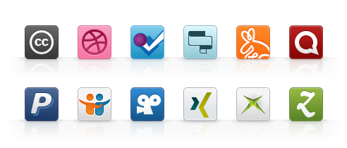
Just as importantly, this update also removes two icons (the Fire Eagle Mascot icon was unnecessary and iMeem has been purchased and absorbed into MySpace). As the collection reaches 70 icons, I’d honestly like to remove more.
This desire perhaps gives an insight into the thinking behind these icons. During the creation of this set I’ve kept a number of design principles in mind, so I thought it would be useful to state these out loud—especially as they may answer some questions being asked about the set.
Design Principles
-
Consistently Styled, Not Overly Designed
As stated when I launched these icons, this icon set was largely inspired by Rogie King’s Social Network Icon Pack. Although his is an absolutely beautifully crafted set, at the same time I felt it exuded to much of its own style. I wanted something a little more generic, yet with an overall consistency not available when simply using the favicons created by the different social media services. I still feel I have some way to go on creating an overall consistency however.
-
Icons for People, Not Companies
Keeping in mind a desire to keep the number of icons to a minimum, I’m only creating icons for which there can be an associated URL, be that to a social profile or social action (such as sharing). For example, this update adds an icon for xBox Live Gamer Cards, but not PlayStation or Wii as these products have no online presence.
I often get asked for icons for different blogging platforms (Blogger, WordPress, Movable Type etc.) yet I would suggest the ‘website’ icon is equally, if perhaps not more suitable for this purpose. Providing icons for every blogging platform or CMS is neither desirable nor necessary.
-
Cater for the 80%
Social media start-ups come and go, and I only wish to create icons for services that have an ounce of longevity. So whilst your favourite social media commentator (or ‘douchebag’ for short) may rave about services like FriendFeed, I only plan to create icons for services that have shown themselves to be successful outside the Silicon Valley echo chamber. Indeed, not creating an icon for FriendFeed has proven to be correct given its acquisition by Facebook and uncertain future.
There have been a number of requests for social media services that are popular in Europe and Asia. I’m currently debating whether to add these services to the set.
-
Provide Alternatives
Not a fan of the monopolies that have started to appear within the social web, you will note that where possible, I’ve provided icons for competing services. So for example this update sees an icon for Foursquare even though I’m personally a fan of Gowalla. The same is true for LinkedIn (I’ve added an icon for XING), Ember (Zootool), Twitter (Identica) and many others.
-
Reflect Established Brand Assets
Where possible, I’ve tried to reflect the design of each icon based on a services own favicon, but I also look at the avatars for these services on Twitter, as well as perform web searches to see if common representations have emerged. This is true for all icons except YouTube—the favicon is an abomination, and I happily defend my decision not to use it in this set.
However, don’t let these principles dissuade you from nominating additions—indeed a number of icons have been added due to such requests. Yet before you do, ask yourself whether an icon would satisfy the above requirements first.