I’m a huge supporter of the BBC, yet for many years I was unimpressed with much of it’s online output, where inconsistent design and poor implementation reflected badly upon one of our country’s greatest institutions.
In the last few years however, there has been a shift in the opposite direction. The iPlayer—the corporation’s time-shifted internet television and radio platform—is an industry leader. Fans of the Semantic Web can marvel at the programmes and music databases that support many aspects of the site, complete with smart URL structures that ensure data remains permanent and findable. A redesigned and customisable home page surfaces a wealth of information to around 13 million people each day.
The speed at which these changes have been rolled out, has in part been aided by the creation of strict visual design guidelines, referred to as the Global Visual Language or GVL.
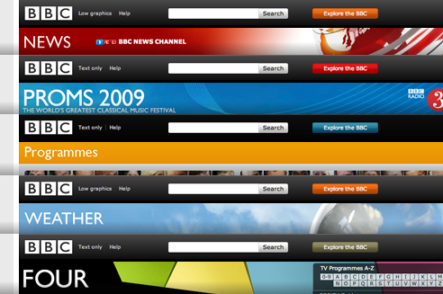
A selection of mastheads used on ‘Barlesque’ sites that adhere to the Global Visual Language v2
These guidelines introduced a single fixed page width, added a common masthead and footer, documented how individual site banners should work and established a simple underlying grid system. All new pages created on the site adhere to these standards meaning users now enjoy a coherent and joined up experience across BBC Online.
The introduction of the GVL was a huge step forward, yet I’ve been critical of a few aspects of it in the past. The insistence on using Verdana for example, especially for page headings, has lead to a few vexed comments from me on the BBC Internet Blog:
In all honesty, it’s bearable (just about) on the home page, but for BBC News Online, it makes the site look incredibly amateurish.
Comment in response to Home Page Two Months On
Whilst I can understand the arguments for better readability, I’d much prefer to see Arial set at 13px rather than the wider (and uglier) Verdana. Its use on other sites such as BBC News Online, particularly for headlines in my opinion makes those sites look rather dated and amateurish. Luckily the Music site excellently demonstrates that Arial can give sites a more contemporary look, and its use should be encouraged elsewhere on the site.
Comment in response to BBC Music Website Relaunch
I guess you could say I’m not a fan of Verdana! Furthermore, the new global masthead hid much of the sites navigation behind an ‘Explore’ button, and also lead to occasions where logos in the banner would clash with the main logo in the masthead:
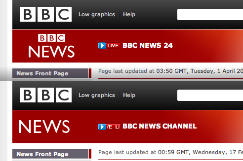
The large logo in the masthead often clashed with logos within section banners. Originally the BBC News site showed the correct logo, but had to be altered to avoid it reading as BBC BBC NEWS.
I was so concerned by these oversights that I thought about ways to rectify these issues. The visual design language had just been applied to the BBC News website at the time, so I set upon redesigning the home and news item pages. The curious are welcome to view the full resolution comps I came up with:
Of course it’s easy to create something like this in isolation, without a full understanding of the design or technical constraints that exist, but I think this demonstrates my frustration with the implementation at the time and—perhaps more importantly—how much I care about the design of the BBC website.
*[GVL]: Global Visual Language
BBC Heaven
Given this background, you can imagine my delight on reading that the corporation is working on a brand new design language with the help of Neville Brody and his agency Research Studios. Not only does it answer my previous criticisms, but the early previews exceed my wildest expectations:
We wanted to find the soul of the BBC. We wanted something distinctive and recognisable; we wanted drama. We knew whatever we created needed to be truly cross-platform and that we needed to simplify our user journeys.”
Bronwyn van der Merwe, A new global visual language for the BBC’s digital services
Whilst this could be viewed as yet another redesign, it strikes me that this project is aimed towards creating a more lasting vision, and this is reflected by the creation of nine key design principles:
-
Modern British: Creates a modern British design aesthetic, something vibrant and quirky that translates outside our national boundaries.
-
Current: Feels current and reflects what’s happening in the UK right now, in real-time. Curates a timeline of Britain and links to the past, to the BBC’s rich archive.
-
Authentic: Sounds authentic and relevant, warm and human. References the BBC’s iconic design and broadcasting heritage. Values the trust placed in the organisation.
-
Compelling: Engages audiences with compelling storytelling. Voices range from serious and authoritative through to witty and entertaining.
-
Distinctive: Stands out from the crowd. Strikes a balance between overly templated, cookie-cutter design and beautiful anarchy. Bold and dramatic.
-
Pioneering: Pioneering design innovations that surprise and delight, yet take the audiences with them.
-
Joined-up: Views all services and platforms as one connected whole but delivers experiences that are sensitive to their context of use.
-
Universal: Services are open and accessible. Interfaces are simple, useful and intuitive.
-
Best: Ambition is to be the best digital media brand in the world.
These principles have resulted in the following output:
Grid
A new grid allows for much flexibility. Thirty-one 16px columns can be combined to create two or four columns on the left-hand side of the page, whilst a wider right-hand column ensures that advertising units (which are shown to international visitors) are accommodated. The choice of grid has lead to the introduction of interwoven vertical and horizontal bands, with the right-hand column becoming a signature feature across the site.
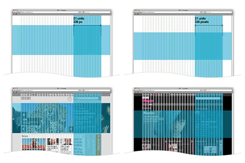
James has been saying recently that designers need to think more carefully about their grid layouts, considering what content needs to be catered for rather than just relying on more rigid and symmetrical layouts. This looks like a textbook example.
Typography
I was excited to read that the new GVL introduces a much more dramatic use of typography:
As well as Gill Sans we’ve introduced big bold type in Helvetica or Arial and restricted variations in size so that we have much greater consistency across the site.
No mention of Verdana. Fingers crossed that it doesn’t make a re-appearance!
Colour
The guidelines also establish a new colour palette and usage guidelines, and suggest that pages will be predominantly neutral, with colour used only to create vibrancy and highlight key areas of the page. Large and dramatic imagery will take centre stage instead.
Navigation
The examples demonstrate a consistent cross-site navigation element across the top of each page (that is, no longer hidden behind a button), whilst section navigation is said to typically run horizontally rather than vertically. The mock-up for the BBC Sport site also shows a bread crumb trail as part of the Cricket section’s sub-navigation too.
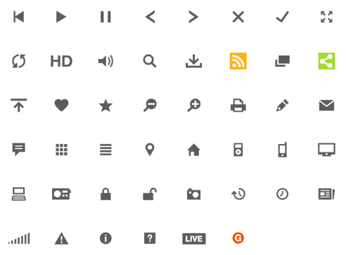
Photography, Iconography and More!
The embedded media players also get an update, as do carousels and other page components. To top it all off, the guidelines elicit the use of a single set of bespoke icons:
Final Thoughts
Much like my attempts to redesign the news website two years ago, there is a sizeable gap between theory and practice, and the true test will come as these guidelines are implemented across the site, and adopted by different parts of the organisation.
This new stripped back and simplified approach speaks to my own design philosophy, so I really hope it succeeds. Indeed, this announcement comes in the same week as the launch of Windows Phone 7 which has a similar laid bare aesthetic.
I do wonder if this work for the BBC, and that for Windows Phone are the first signs of a move away from the ‘Web 2.0’ look by larger organisations. I will happily accept the painful irony, that having waited so many years for rounded corners and background gradients to be implemented in browsers, the trend that demands them will no longer be with us.
If it wasn’t obvious, I’m absolutely bowled over by what the BBC User Experience & Design team and Research Studios have presented so far. I hope this early preview is the first of many insights to come. Given the BBC’s agile development process, we shouldn’t have to wait to long to see it in the wild either.