I’m able to grab a spare few minutes to get round to talking about the all new Ning that we launched almost three weeks ago. In that time, I have heard lots of positive feedback from people at SXSW, and the ever increasing collection of reviews and reactions you can find online. However I want to talk a little about the project from a more personal perspective.
Previously, on Ning
The former ning.com home pages, whilst a massive improvement over what they replaced, were almost immediately fraught with problems. The first and most obvious of these being that I designed a site for 1024x768 screens, for an audience that was turned out to be 800x600 based. I’m not sure I ever liked the overall design I had come up with either (especially compared with projects I had worked on prior to it).
On the application side of things, we went from 20 simple ‘Social Web Apps’, to 3 ‘Social Websites’, but in both cases we were spreading ourselves too thin, and confusing our users along the way.
The Ningbar, whilst incredibly powerful from an engineering aspect, tried to do too much as well—application management, messaging, friendships, user profiles, present stats, promote ning, clone apps…
However last year was very much a period of learning. Be that seeing what the platform was capable of behind the scenes, and understanding what types of interaction users expected or the language we should use—essentially what worked and what didn’t—on the front-end. All of this was valuable information we made sure to learn from.
Twice as Nice
So today, the ning.com you see is designed for 800x600 screens. Instead of trying to cram in every possible feature, we have started simple, and will add features and pages as we require them. And nowhere will you find pages consisting entirely of tag maps!
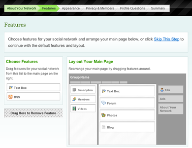
The same is true for our new social networking application—yes that’s just one application—where we can focus 100% of our energy and talent. Whilst parts of it are based on our previous Videos and Photos apps, you will notice that parts of the previous design have either been removed, or placement and interaction reconsidered.

We have tried to ensure that the design is deceptively simple (with more advanced features for those who want them). Gradually we will be adding new features, whilst at the same time continually evolving existing ones.
I also want to take a moment to mention our Senior Interaction Designer, David Warner, who has really helped shape this product (despite what some others may say). It’s been great having somebody to bounce ideas of and ensure that every aspect of the design is being fully thought through. I’m learning loads in the process too!
Totally ‘Yoursable’
For me, the biggest gratification I get from the product is just how customisable it is—something I have always been banging the drum for.
What we have now is infinitely more ‘make-it-yoursable’ than anything else in the marketplace, yet we still want to go further, and give network creators (and their users) even more choice, more freedom.
Our goal is to allow them to take the credit for their amazing creations, not us. If you want to see how committed we are to that principle, then see how easy we make it for you to remove our logo from the Ningbar. I’m pretty sure no other service would let you do that, and if they did, it would certainly be at a premium.
What we have today is a solid foundation to build upon, and something I’m glad to be associated with. I am certainly looking forward to a year in which people no longer ask me ‘so what is this Ning thing then?’, but instead pester me as to why I haven’t joined their social network!
Some Reactions to the New Ning
I just had a play with Ning and you guys have done a great job—well done! Super-easy and really fun.
Ning has completely rebranded as a social network builder. Personally, I think this is a brilliant move. After just a few seconds on the front page, it’s absolutely clear what you can do. You can still make all the same stuff that you always could on Ning—videos, photos, blogs—but now it’s all wrapped up as part of a clearer goal: creating your own social network site.
After seeing a demo earlier this afternoon, I’m now willing to offer a full mea culpa. The new Ning is an impressive and useful service.
Michael Arrington at TechCrunch
The year of work Ning has put into the relaunch of this product clearly shows. They have created a beautiful, blissfully simple interface that I think is actually average-people friendly.