Britain Rebranded
The Union Flag is perhaps the best and most powerful pieces of design. Since its adoption in 1801, it has had close associations with many aspects of this countries history and culture. Ranging from World War Two to the swinging sixties, from the monarchy to sporting victories, from Punk to Britpop. It has also been associated with the National Front movement and racism. However, it has still managed to maintain it’s popularity with people of all ages and has proved to be timeless.
Approaching the end of the century however, the image of the country it represents has not fared so well. According to a report published by the think-tank Demos in September 1997, Britain’s image abroad was one of a backward looking country. In the eyes of consumers, we produced uncompetitive goods of poor quality, for companies looking to invest, Britain was hostile to free trade and riddled with labour disputes, and to potential tourists, a country were they would encounter bad weather and shoddy bed and breakfasts.
Britain was in need of a new identity, but this was at a time when the country was unsure where it’s identity actually lay.
British Airways and the BTA
British companies now operate on a global scale and many had decided that any British associations were not good for business. A look at the number of privatised companies that have changed their names will tell you this. British Telecom was one of the first when it became BT in the early nineties—when many other national telecom companies—France Telecom and Deutche Telecom for example haven’t felt the need. British Gas (now BG) and British Steel (now Corus) are two recent examples.
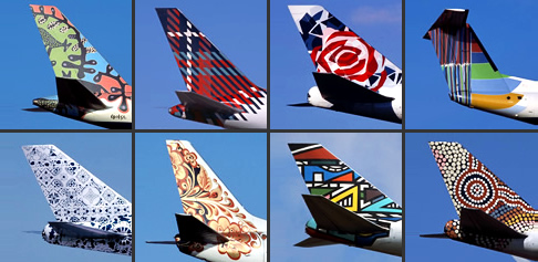
![]() Another such company finding itself in the media spotlight was British Airways, now preferring to be known as BA. As part of their 60 million pound corporate re-branding, they decided to ‘ditch’ the familiar Union Flag tail fins, in exchange for a number of multicultural designs that represented their passengers and their destinations in order to become “the undisputed leader in world travel”. But by replacing the Union Flag with these new designs, suggested that to do this, being British was bad for business.
Another such company finding itself in the media spotlight was British Airways, now preferring to be known as BA. As part of their 60 million pound corporate re-branding, they decided to ‘ditch’ the familiar Union Flag tail fins, in exchange for a number of multicultural designs that represented their passengers and their destinations in order to become “the undisputed leader in world travel”. But by replacing the Union Flag with these new designs, suggested that to do this, being British was bad for business.
British Airways World ‘Tails’. The tail designs shown here represented Kalahari Desert, Scotland, England, Netherlands, Russia, Africa and Australia.
However, the whole scheme was a tremendous fiasco. That is not to say that it was due to the removal of the flag, or that because the rebranding exercise wasn’t a good idea. In fact it made BA stand out in a overcrowded market place. But it wasn’t an identity that suited BA—the company just didn’t match the brave, lively and multicultural liveries painted on its planes. But by dropping the flag, it produced much unwanted bad press in BA’s home country.
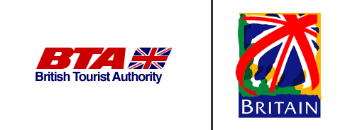
The whole furore that the BA affair caused alerted the British public to the fact that companies and organisations were uncomfortable with their British identity. This was shown in the interest by the media in the British Tourist Authority’s (BTA) announcement that it was to rebrand itself. How this was done was very important, as this was how the rest of the world would see Britain.
The final image, although not one that abandoned the Union Flag, was one that subdued it, mixing it with yellow and green and moving it slightly of centre. After it was launched, it was described in the Guardian as “harmless, old-fashioned, apolitical and jolly good fun”. But was it going change tourists perception of Britain?
The old BTA logo (left) and its replacement (right)
New Labour, New Britain
The Design Council was aware of the problem with Britain’s identity and so assembled a discussion group that included many well-known names from the world of broadcasting, business, film, journalism and design (Alan Yentob, Robert Ayling, Sir David Puttnam, John Hegarty). The results were released in a discussion paper entitled ‘New Brand for a New Britain’. It called for the government to position Britain “as one of the world’s most forward-thinking, innovative and creative nations”.
On the day the Design Council published it’s discussion paper, the Labour Party came into power. This was a party that had seen the benefits of its own ‘New Labour’ rebranding exercise, by winning the general election with a large majority. If any government was going to take note of the reports findings, it was going to be this one.
The Design Council commissioned Demos, to produce a report on how we might rethink our nations identity. Mark Leonard authored the report called ‘Britain™: Renewing our Identity’; and contained the findings mentioned earlier—that of Britain as backward looking. Leonard came to the conclusion that Britain’s image could be changed by rebranding itself. He suggested six ‘stories’ about were the country has been and were it is going that could form an important part of the nations identity:
- Hub UK
- Britain has always been a central passageway of goods, ideas and people (Heathrow being the world’s busiest airport for international passengers), and we are in a time zone that allows us to talk to Asia in the morning and North America in in the afternoon.
- Creative Island
- From Shakespeare to Roald Dahl, Handel to the Beatles, Great Britain has been a world leader in both high art and pop culture—20% of all music produced originates from the UK.
- United Colours of Britain
- The country is now home to people to of nearly every race and religion.
- Open for business
- 8 out of the 10 of the most profitable retailers are British.
- Britain as a silent revolutionary
- Britain is a prolific inventor of new forms of organisation and new ways of running society for example: parliaments, post offices and privatisation.
- The Nation of Fair Play
- We pride ourselves on a ‘sense of cricket’: fairness, charity, manners, support for the underdog. A new Britain could still adhere to the nation’s old values.
Leonard also suggested that Britain’s long-standing traditions were in fact invented and relatively recently—the flag, the monarchy (in its modern form), coronations etc. If this was the case, then surely newer, cooler ones could be established.
The downfall with the report was that his solution to Britain’s image problem is just that—an image problem. However he failed to acknowledge that any new rebranding exercise should be based on reality. It’s okay to say “United Colours of Britain” but Britain has an unfortunate history of racism and imperial arrogance—the recent Stephen Lawrence case is proof of this.
Wollf Olins, the brand-identity consultants responsible for identities such as those for BT and Orange, also joined the debate with their concept of Britain plc. This was more realistic in that any sort of rebranding should be based on reality—if not, the whole thing would soon fall apart.
They also brought into the debate the idea of thinking of countries more like companies. As companies have to have a successful brand to be able to promote their goods/services in order to make a profit and compete with others, so do countries in order to promote inward investment, tourism and the sale of exported goods. This is not a new idea. Spain successfully rebranded itself using Miro’s vibrant Espana painting as a national logo which summed up the countries positive post-franco optimism. Large cities such as New York have also undertaken similar exercises.
When a country such as Britain spends 800 million pounds a year on promoting itself overseas, it helps if the image and the brand is consistent and that all the organisations involved in promoting this brand: the Foreign Office, the British Tourist Authority etc. are co-ordinated. Not only will this brand increase the countries profile, but will inevitably create an ‘identity premium’. If this is strong, than any company that operates from that country will be able to charge more due to that premium.
What’s Being Done
With Labour in power, it wasn’t long before we started to see stars from the world of design, business and entertainment being entertained at No. 10 and soon the idea of ‘Cool Britannia’ was alive and kicking. Whether ‘Cool Britannia’ was more for the benefit of the government than the country is debatable, but there was certainly a new sense of national optimism, with the British film and fashion industries in particular enjoying a renaissance period.
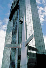
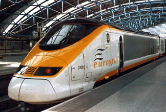
As a means of promoting British design, technology, and innovation around the world, the Millennium Products initiative was launched, in which British companies were asked to demonstrate Britain’s ability to lead the world. When the final round of products that had achieved Millennium Product status were announced in December 1999, the final number was brought up to 1012. Products ranged from designs such as that of the Eurostar train, chairs and modern day sign posting in Birmingham, to useful inventions such as the clockwork radio.
These are now touring the world—currently being exhibited at EXPO 2000 in Hanover as well as British Government buildings around the world.
Modern sign posting in Birmingham and teh Eurostar train
Other initiatives included the Foreign Office setting up ‘Panel 2000’—an advisory group to look at how the government could co-ordinate and improve its promotion of Britain abroad and the production of a video ‘Designers for the World’ showcasing Britain’s leading designers. It also launched the award winning ‘Planet Britain’ website promoting a contemporary image of Britain to 16-25 year olds around the world.
In fact initiatives were encouraged to be taken up by government departments and organisations involved in the promotion of Britain and this includes the likes of the Department of Culture Media and Sport and the British Council.
It is still to early to tell whether this is all making a difference to our image abroad, but at least there is now co-ordination in promoting the country aboard and design is playing an important part.