Conferences can be quite wasteful affairs. In addition to swag bags filled with magazines, leaflets and free gifts, there is often a programme detailing the schedule and providing some background on the speakers.

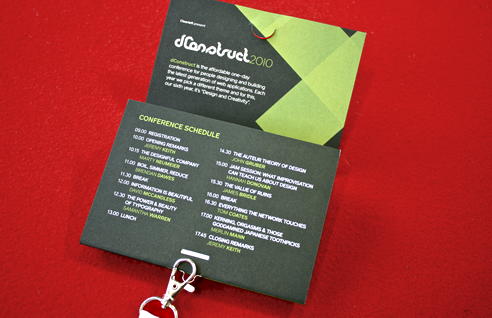
This years dConstruct conference badge. Photo by James Box
It’s in this environment that I’ve long admired Clearleft’s approach at dConstruct. Not only have swag bags been banished, but the programmes have been combined with name badges, and placed in clear plastic wallets so they could be attached to a lanyard.
However, I often wondered if the plastic wallet was needed at all. Not only is plastic difficult to recycle (or at least know if it can be recycled), but using it to hold the programme necessitates removing it every time you wish to read it.
Earlier this year Christopher Fahey crystallised these thoughts in his post ‘A Book on a Hook’ in which he demonstrated the badge designed for ‘The Web and Beyond’ conference in Amsterdam. Like previous dConstruct conferences, this design combined the programme and name badge, yet it used loop staples so it could be attached to a lanyard directly. Further still, the contents were printed upside-down so it could be read whilst being worn.
With my campaign to improve our industry’s impact on the environment in mind, now seemed the perfect opportunity to try something similar at this years dConstruct conference.
In typical Clearleft style, we created a paper prototype to test the mechanics of the design. This revealed a number of possible weaknesses, both with the latch and from continually opening and closing the programme. Luckily, we had the print expertise of Gareth Jones at Jack Design, who saw our vision, and recommended paper stock and latch mechanisms to mitigate these issues. Prototyping with final design proofs saw further iteration, changing the orientation and placement of pages to improve the flow, adjusting page sizes and folds to encourage the desired browsing behaviour.
The final product looks really great, and I’m excited to see them being used this Friday. Not only are they a greener alternative to previous years (in addition to the lanyards made from recycled plastic bottles) but they’ve worked out a little cheaper to produce too. Hopefully this format will prove popular and become a feature of future conferences. This being the first time we’ve used such a design I’m sure there will be plenty of feedback, so if you’re at the conference please let me know your thoughts.