Quite often at Clearleft we like to do activities together as a company. In the past this has meant visiting museums in London, a night out at the Brighton Comedy Festival and of course our popular movie nights. Last week however it was time to do something a little more practical.
With Dave Gray speaking at this year’s UX London, Andy asked if he would then visit Brighton and run a sketching workshop for everyone at Clearleft.
Whilst I wasn’t sure what to expect initially, I soon realised this was an excellent opportunity to spend two days away from the computer and reconnect with those traditional—although no less effective—communication tools, pen and paper, tools that I had since replaced with software.
The throughly nice (and incredibly tall) Dave talked us through some warming up exercises, drawing lines and simple shapes, combining these to create representations of people and objects, before building upon these skills to a point where we could work together to visually communicate ideas and processes. You can see some of my resulting sketches on Flickr.
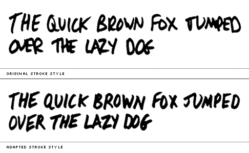
However, what I found most useful from the two days was a little tip on how to perfect a neater writing style. Not only was his advice to slow down (a common theme throughout the workshop) but also to use consistent angles for strokes—slanted to the right for the verticals and slightly upwards for the horizontals.

My original writing style (top) versus that recommended by Dave Gray (bottom).
I loved the simplicity of this tip—obvious in retrospect—yet sometimes you just need a third party to point these things out. Indeed, much of the workshop revolved around building confidence. For example you needn’t worry about the quality of your sketches along as they communicate your ideas effectively.
The one lasting idea I will take a way from this workshop is to always carry a sketch book, and Dave gave us some ideas for what to sketch inside it too. Rather than focus on objects immediately in front of you, look more to those in the distance as this will help you break complex objects into elementary shapes. Hopefully by sketching like this, your proficiency and confidence will improve too.