With an escalating national debt, the talk at this months party conferences is of cuts to public spending and smaller, more efficient government. I believe one clear way of achieving this would be to introduce a single unified brand across government.
There are currently 24 ministerial departments and thousands of executive agencies, commissions, and authorities, each using separate logos and identity packages. In the last two years, numerous reorganisations under Gordon Brown have meant that further identities, websites and publicity materials have been required, or equally made redundant. Not only do we have a government that appears fragmented and disorganised, but one where successive change is expensive and wasteful.
With a general election just months away we can expect more of the same, especially when the Conservative party—widely expected to be the next party of government—plans to reduce the overall number of ministerial departments and executive agencies.
Yet I propose that any such reorganisation would be a perfect opportunity to rethink how the executive communicates with the public. If we want to talk about reducing bureaucracy, and simplifying government, then surely we need to think about how it can be represented with one single common identity rather than a multitude of different logos.
Government Identities Around the World
Many governments have a similar array of logos of course, but a few countries have implemented more coherent branding strategies. I illustrate two such schemes later, but examples can also be found in Canada, Australia, South Africa and a number of other countries too.
- Canadian Federal Identity Program
- Australian Government Branding Guidelines (PDF Document)
- South African Government Corporate Identity Guidelines (PDF Document)
United States
Whilst there is no single identity strategy within the US Federal Government, there is some consistency, developed more due to historical precedent than any centralised planning. Here government departments, federal agencies or programmes use round ‘seals’, often basing their designs on that of the Great Seal (or at least referencing aspects of it such as the Bald Eagle or the Stars and Stripes).
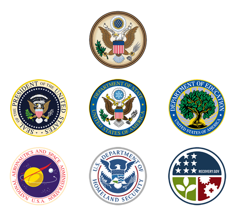
Seals of US Federal Government
The Great Seal of the United States and seals for the President, Department of State, Department of Education, NASA, Department of Homeland Security (DHS) and the Recovery.gov website. Both the DHS and Recovery.gov seals are recent creations, and whilst they have simpler designs, they still retain the circular format and visual language used in other seals.
Germany
The unification of East and West Germany in 1990 provided an ideal platform on which to create a single identity for the new federal government.
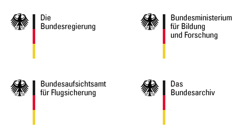
Logos used by the German Federal Government
One single (and scalable) identity system is used across all federal ministries and agencies. Shown here are logos for the Federal Goverment, the Federal Ministry of Education and Research, the Federal Supervisory Authority for Air Navigation Services and the Federal Archives.
A student competition held in 1996 was won by Jürgen Huber and Lisa Eidt with a design combining the federal eagle, the German flag and a word-mark that could vary depending on department. They gained an internship at MetaDesign as part of their reward, and worked with the agency to finalise the design.
The final identity was launched in June 1999 and MetaDesign has been involved ever since. They continue to assist the federal government with implementation of the brand, by designing tools and creating frameworks that allow individual ministries to maintain a level of creative freedom for their specific requirements.
Netherlands
Last year the Dutch Government took a similar approach with it’s ‘Project 1 Logo’ initiative.
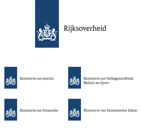
Logos for Dutch Government and Ministries
A single identity system is used across the different Dutch ministries. Shown below the main government logo are those for the ministries of Justice; Health, Welfare and Sport; Finance and Foreign Affairs.
With over 200 departments and ministries facing mounting costs maintaining different logos, typefaces, print materials and signage, the project aimed to improve communication between citizens and the government by presenting a unified image rather than the fragmented one it replaced.
The identity was created by Rotterdam based Studio Dunbar with a custom typeface (‘Rijksoverheid’) designed by Peter Verheul. Announced in 2008, the roll out is intended to be complete by 2011.
- Project 1 Logo Design Guidelines (in Dutch, Translated)
Future Approach
Whilst I’m sure there may be resistance to such a visible (and initially expensive) change in the UK, with a phased roll out, I think the long term benefits are clear. Indeed, holistic branding exercises are already common within British government. The Northern Ireland Executive uses a cohesive identity across its different departments and the NHS in England has been using strict branding guidelines for several years now.
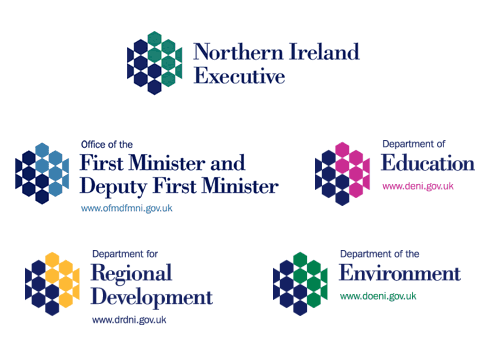
Logos used within the Northern Ireland Executive.
Design
In fact the ‘HM Government’ logo introduced earlier this decade may provide some clues to what a unified identify might look like, with the governments coat of arms sat alongside the word-mark set in Gill Sans Light. Logos for the Ministry of Justice, Treasury, Foreign and Cabinet Offices also feature the coat of arms, whilst the Treasury and the Department for Business Innovation and Skills use Gill Sans too.
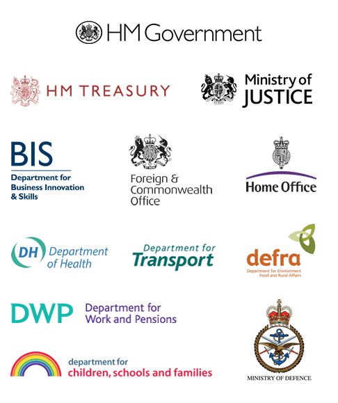
A selection of logos used by the British government today
Whilst there is no coherent identity within British Government, a number of patterns emerge, with the coat of arms and Gill Sans being popular choices for some logos. However not every department shares this visual language, and all have implemented separate identity schemes.
The coat of arms is probably the device on which any future identity work would be based, although it requires drastic simplification as it clearly doesn’t resize well or reproduce cleanly enough on screen. Whilst Gill Sans is often considered the de facto font for anything British, I would love to see a custom typeface designed in the same vein as that for the Dutch government. This would have to work across the wide spectrum of government activity, and such heavy usage may result in it becoming a British classic too (and one might argue better suited to the modern requirements of the 21st Century).
There is also a case to be made for simpler department names, as many currently read like shopping lists (the Department for Children, Schools and Families and the Department for Environment, Food and Rural Affairs being two fine examples). Such naming typically leads to meaningless abbreviation (i.e. DCSF and DEFRA) which only distances the government from the public further.
Personally I would like to see departments named ministries again—partly because I’m a stickler for tradition—but it might better associate departments with the ministers that run them too.
Below is a suggestion as to how a unified identity might look, although I’m sure there are far more creative solutions to this problem. I’m in no doubt that this is a massive project, that would require a lot of research, and any identity system would need to easily adapt to the continual changes of government in this country.
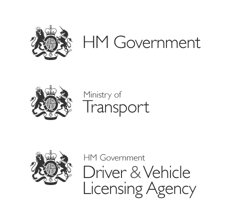
How a unified identity for the British government might look.
Given the growing number of identity schemes implemented by other governments around the world, it’s clear that we are lagging behind in this regard. However there is still a massive opportunity for the British design community to think about how such a problem could be solved. Given David Cameron’s re-branding of his own party, I’m hopeful that such a challenge isn’t too far off from being set.