In the last few years, two public organisations in Walsall have undergone renewals, and both have choosen to reflect this change with simpler identities.
Walsall Council
Walsall Metropolitan Borough Council, after many year under Labour rule, became a Conservative council in 2004. This led to a number of construction projects being initiated in the area, most notably upgrades to the ring road, canal-side developments on Wolverhampton Street, and the creation of a new Civic Quarter in the town centre. Possibly to reflect this change in direction, in 2005 the council revealed a modernised logo, and simplified its name to ‘Walsall Council’.
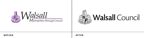
The new logo is cleaner and more contemporary than it’s predecessor, and from what I’ve seen only available in one colour—great news for tax payers as this significantly reduces printing costs.
Whilst most councils tend to prefer abstract representations of leaves and trees when they re-brand (perhaps in the hope that it will make their respective locations look greener than they actually are), Walsall Council chose to retain their coat of arms. However it has been redrawn, no doubt with an eye to better reproduction on screen (note the thicker strokes outlining key elements of the design). The word-mark, after some detection work, appears to be set in Cronos Pro. This sans-serif font, plus a consistent font size and upright letter-forms drastically increases legibility over the previously italicised serif incarnation.
As you can tell, I’m really pleased with the updated logo. Whilst it won’t win any awards, it’s beautiful in it’s simplicity—cheaper to reproduce, easier to read, contemporary whilst at the same maintaining an element of tradition.
Sadly, I haven’t been able to find any information about who was responsible for this identity. Please leave details in the comments if you know.
Walsall College
Another big regeneration project nearing completion in the town is the new campus for Walsall College (the buildings currently on St. Paul’s Street will soon be demolished to make way for a Tesco supermarket). Perhaps it’s no surprise that this organisation recently revealed a new identity too. Previously known as Walsall College of Arts & Technology (such a mouthful that it was often shortened to WALCAT), it also simplified it’s name to just ‘Walsall College’.

Unlike the Council, there seems to be no desire to retain elements from the previous logo. Frankly I never understood what the previous logo was meant to represent, although I guess the wave like shapes were intended to be wings of some sort (where wings equate to aspiration and reaching higher). The new logo does keep the wing-like motif, yet is equally vague, with the wings coming together to form a rib-cage like shape. Again, if you know who was behind this logo, please let me know.